
Why Simple AI Apps Are Quietly Making Millions
The highest-earning AI apps do one tiny job and market it relentlessly. Here is the pattern, with an accounting firm tool as a worked example.

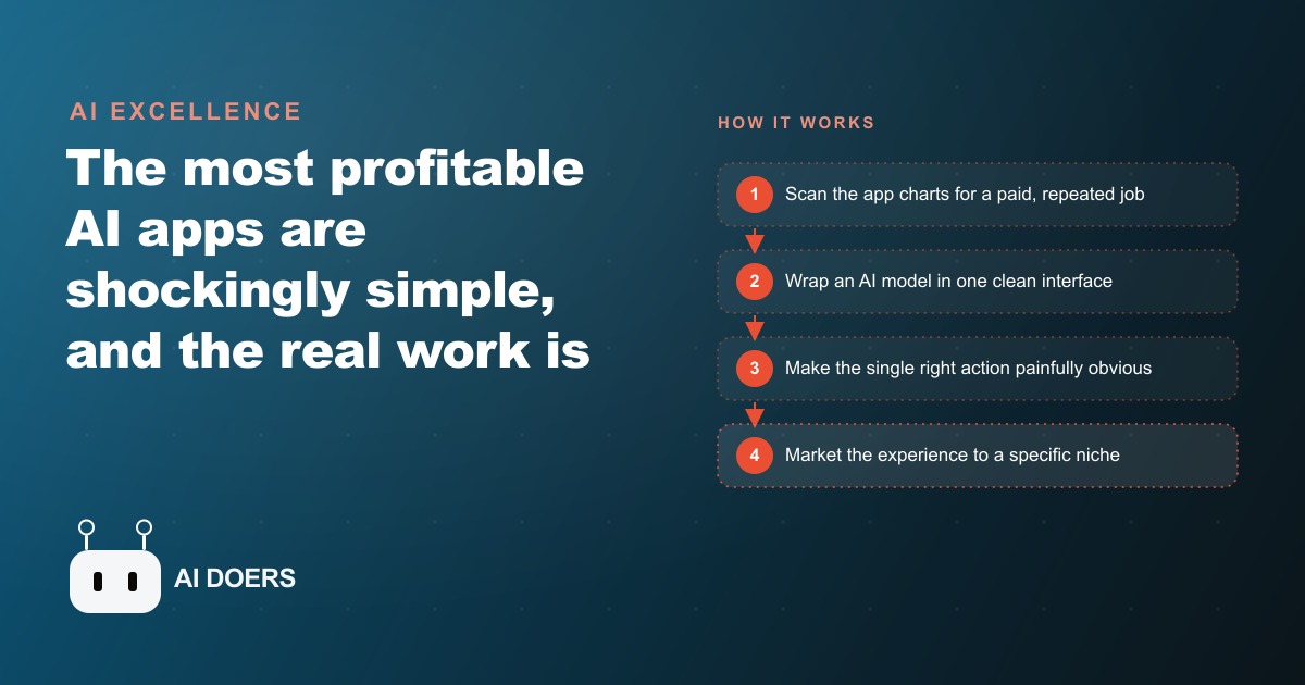
A homework-help app with no proprietary technology, no research team, and no competitive moat beyond a clean interface sits in the top ten of its app store category and earns more per month than many small professional service businesses gross in a year. I am Madhuranjan Kumar, and when I first looked at the top-earning AI apps across both major app stores, the pattern was so consistent it was almost surprising. The winners are not the most technically impressive. They are the simplest, the most focused, and the most aggressively marketed. Understanding why that pattern holds, and how to replicate it in a professional services context, is the entire point of this piece.
The App Store Charts Told the Accounting Firm Exactly What to Build
The story I want to walk through is about an accounting firm that built a focused AI tool. But before the build, there was a research step that most people skip, and skipping it is the most common reason a well-built app earns nothing.
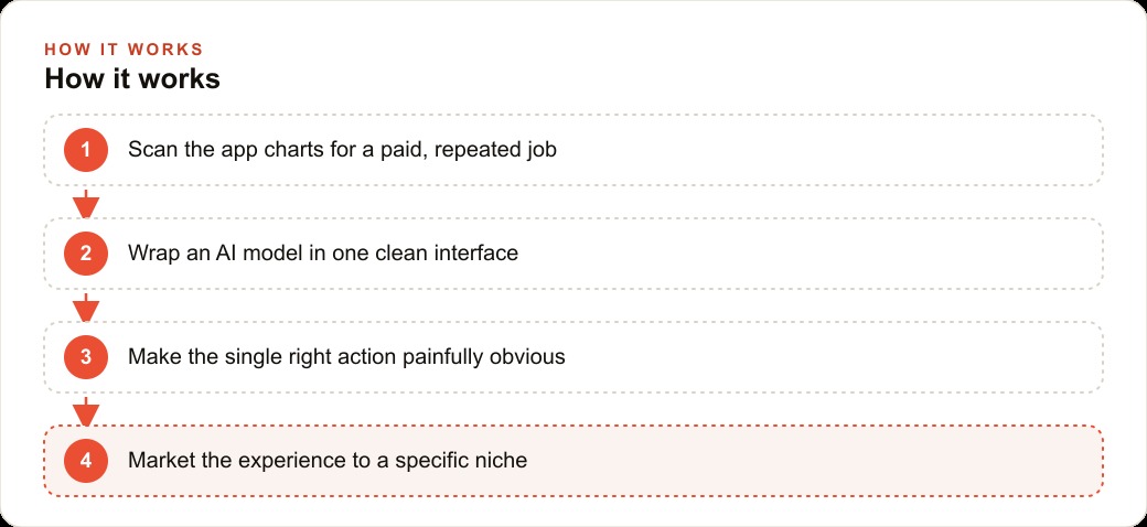
The right starting point is the app store top charts, filtered to a category you understand. Open the top paid and top grossing lists and read them critically. Look at what jobs the top apps are doing. Note how narrow the scope of each one is. A homework helper takes a photo of a question and returns the worked solution. A calorie counter takes a photo of a plate and returns the nutritional breakdown. A grammar checker takes a sentence and returns the corrected version. Every top earner does one thing and does it fast. None of them require the user to understand how they work. They require the user to know one thing: what to photograph or type and where to tap.
The next step is to read the reviews, especially the one and two-star ones. The top charts frequently contain apps with strong demand but significant user frustration. A tool that thousands of people are paying for despite actively complaining about it is a precise signal. It tells you the market is real and paying, and the current solution is not good enough. Building the version that fixes the top complaint in a domain you understand deeply is the formula that produces a top-charting app more reliably than any other approach.
For the accounting firm in this story, the category was financial tools and the top complaint in the existing receipt apps was categorization accuracy. Users were photographing receipts and getting back wrong or vague categories, requiring manual correction that undermined the point of the automation. The firm understood, better than any app developer could, exactly which categories mattered for small business tax purposes and exactly which edge cases tripped up general AI classification. That domain knowledge was the asset. The chart research confirmed there was a paying audience for the job. The one-star reviews defined the improvement to make.
The Right Job: Turn a Receipt Photo Into a Spreadsheet Row
Having confirmed the opportunity, the firm defined the job with the narrowness that the top apps share. Not a full bookkeeping solution. Not an accounting platform. One job: take a receipt photo or a bank statement export and return a clean, accurately categorized spreadsheet row, formatted for the firm's bookkeeping software. Photo or file in, structured data out, immediately ready to paste.
The scope decision is where most product ideas go wrong. The natural instinct when building a professional tool is to add features. A receipt tool could also track mileage. It could also generate expense reports. It could also connect to the bank directly. Each additional feature is another thing that can break, another flow the user has to understand, and another reason the first screen is cluttered rather than obvious. The top earners on the app store charts have exactly one feature. Everything else is an upsell that comes later, after the core experience has earned the user's trust.
The firm resisted the instinct to add scope. The tool does one job. The marketing message is one sentence: photograph a receipt and get a categorized spreadsheet row in ten seconds. That sentence fits in a push notification, a social media post, or a word-of-mouth recommendation. Complex products require explanation. Simple products recommend themselves.
The accuracy advantage came directly from domain knowledge. The firm programmed the classification logic not by training a model from scratch but by writing precise instructions into a prompt that described the firm's actual categorization rules, common exceptions by industry, and the specific fields required by the bookkeeping software its clients use. A general AI model prompted with specific professional rules performs substantially better on a narrow professional task than it does on the same task with a generic prompt. The expertise was not in the code. It was in the rules the code applied.
One Weekend, One API, One Screen That Made the Action Obvious
The first working version took one weekend. The technical core is a call to a vision model API: the app sends the receipt image and the categorization prompt, receives structured JSON output, and formats it for display. There is no proprietary technology. There is no machine learning pipeline. There is an API call, a well-written prompt, and a clean interface.
The interface decision was as deliberate as the scope decision. The entire first screen is one button: photograph a receipt. No menu. No settings. No onboarding flow. The user opens the app and sees one obvious action. After the photograph is taken, the app shows the result in a format that mirrors what the user will paste into their bookkeeping tool. A second tap copies it. A third tap clears it for the next receipt. Three taps, one job done.
The reasoning behind this level of simplicity is both practical and psychological. Practically, every additional element on the first screen increases the time from open to first result. Each additional second costs some percentage of users who decide it is not worth the wait. The apps that earn the most money tend to have the fastest path from launch to first useful output. Psychologically, an interface that makes the right action obvious removes the small moment of uncertainty that causes many users to abandon a new tool before they have experienced its value. The first screen is not a menu. It is a promise: do this one thing and get this one result.
The pricing was set by working backward from the value the tool replaced. A bookkeeper charging sixty-five dollars per hour to manually sort and categorize receipts spends roughly two hours per small business client per month on average. The tool replaces that two hours of manual work with fifteen minutes of reviewing AI output. At that value, charging eight dollars per month per user is not a pricing decision at all. It is so obviously reasonable that most users do not think about it. Price your tool on what the user saves, not on what it cost you to build.
The First Twenty Users and What the Numbers Showed
The first twenty users came from the firm's existing client base. This was the most important distribution decision in the product's early life. The firm already had relationships with small business owners who trusted their categorization judgment. Those clients were the right first users because they could evaluate the output accurately, their feedback was specific rather than vague, and their willingness to pay was informed by direct knowledge of what the manual alternative cost in time and fees.
The feedback from the first twenty users revealed two things. First, the categorization accuracy was high enough on standard receipts that most users never needed to correct the output. The domain-specific prompting had produced the accuracy improvement that the one-star reviews of competing apps had identified as the gap to fill. Second, the edge case that produced the most incorrect categorizations was meals that crossed the line between personal and business expense, which is a judgment call that even a human bookkeeper sometimes needs to ask about. The firm added a low-confidence flag for that category, prompting the user to confirm rather than accepting the classification silently. That flag reduced correction friction significantly and improved the review process from feeling like error-checking to feeling like approval.
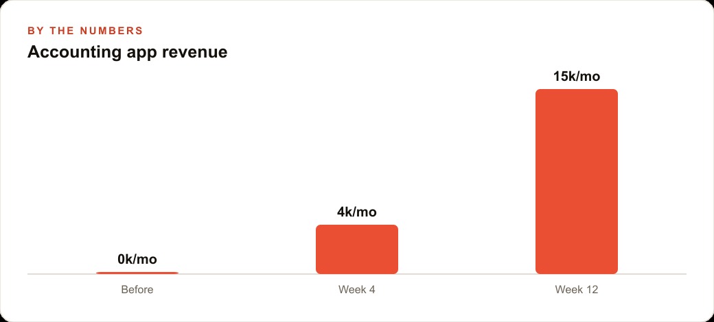
The numbers at week four: twenty paying users at eight dollars per month, one hundred sixty dollars in monthly recurring revenue. Not impressive on its own, but the retention rate was one hundred percent through the first month, which told a clearer story than the revenue did. Users who stay through the first month of a new tool stay for a long time, because they have invested in the habit. The first month is where most tools lose their users, and this one did not lose any.
For a professional services firm managing SEO and organic search for local businesses, this retention signal is the metric worth watching most closely in a new product's early life. A high first-month retention rate is the indicator that the tool has solved a real problem in a way that fits into the user's existing workflow. Without that fit, revenue is temporary. With it, revenue compounds.
Marketing Turned Out to Be the Actual Product
At twelve weeks, the tool had sixty paying users from word of mouth through the existing client base. The firm had validated the product and the price. The constraint was no longer the tool. It was distribution.
This is the point where most professional service firms stall. The tool is working. The users who try it stay. But the number of people trying it is limited by the number of people the firm already knows. Growing beyond the existing client base requires a different kind of effort than building the tool required, and it requires a different skill set.
The firm made three distribution decisions. First, they published the tool on both major app stores with a clear, specific title that named the job: Business Receipt Categorizer for QuickBooks and Xero. Search results in app stores heavily favor apps whose names match the search term, and small business owners searching for receipt management tools type exactly those words. The specific title generated organic downloads that required no marketing spend.
Second, they created content that demonstrated the tool on the specific use cases their target users were Googling. A short video showing a restaurant receipt being categorized in ten seconds, with the specific QuickBooks category appearing in the output, was more effective at generating downloads than any ad creative would have been, because it answered the exact question the target user was searching for rather than interrupting them with something unrelated.
Third, they offered a referral incentive: one month free for every user who referred a paying customer. The accounting firm client base has a natural referral network. Business owners talk to other business owners, and a tool one of them uses is a natural topic in those conversations. Making the referral economically rewarding for the referrer accelerated a process that was already happening organically.
For businesses running Facebook and Instagram ad campaigns for client acquisition, this sequence suggests a principle: content that demonstrates the specific output of the tool on a specific use case outperforms image creative that describes what the tool does in abstract terms. Show the receipt going in and the spreadsheet row coming out. The person who was going to buy is already sold by the end of the ten-second video. The person who was not going to buy would not have been sold by any creative.
The Revenue Picture at Month Twelve
At the end of twelve months, the tool had two hundred thirty paying users at eight dollars per month, generating eighteen thousand four hundred dollars in annual recurring revenue from a product that required no ongoing staff time to operate. The categorization model ran on API calls that cost the firm roughly forty cents per active user per month at average usage levels, so the gross margin was high and the infrastructure cost was negligible.
The more significant business impact was on the firm's service relationships. Clients using the tool arrived at month-end close with organized, pre-categorized data rather than a folder of unsorted photographs. The time the bookkeeping staff spent on each client's monthly close dropped from an average of three hours to ninety minutes. Across the firm's twenty direct clients, that saved sixty hours of staff time per month. At the firm's internal rate of sixty-five dollars per hour, that represented nearly four thousand dollars per month in recovered capacity, capacity that could be directed toward taking new clients or toward higher-value advisory work.
The tool also changed the firm's market positioning in a way that general marketing could not have achieved. Being the accounting firm that has a working AI receipt categorization app is a differentiator that is immediate, demonstrable, and relevant to every prospective client. A thirty-second demonstration of the receipt tool during a new client conversation communicated more about the firm's operational sophistication than any case study or testimonial could.
The lesson I draw from this is consistent with the pattern in the app store charts. The tool that earns the most money is not the most technically sophisticated. It is the one that does one job accurately for a specific audience, makes that job obvious on the first screen, and is marketed consistently to the people who feel the problem every day. The code is the smallest part of what makes it work. The domain knowledge that makes the categorization accurate, the product decision that made the scope narrow, and the distribution discipline that reached the right audience repeatedly are what produced the result.
Building the first version of a tool like this in your own professional domain is a weekend of focused work. Getting the prompting right for your specific categorization or calculation logic is a few days of refinement with real data. Getting to twenty paying users from your existing client base is a single email to the people who already trust your judgment. The compounding starts the moment the first user stays through the first month. That is the moment the machine turns on, and the hardest part of the whole process is believing it will happen before you have seen it.
That is exactly what we do at AI DOERS. Book a private 30-minute call with Madhuranjan Kumar and we will map the fastest path to it for your specific business.
Book your call →
Madhuranjan Kumar
Madhuranjan Kumar brings 20 years of performance-marketing experience and has managed over $200 million in Facebook ad spend for brands across the United States and beyond. His expertise spans the full modern marketing stack: Meta, Google Ads, TikTok, email automation, CRM, and the websites that hold it together. At AI DOERS he turns that track record into lead-generation systems for businesses across every industry.