
Vibe Designing: How to Build a Polished App With AI Tools and No Code
Polish is what makes a tool feel real. Here is how I would use a small set of AI tools to design the layout, icons, images, and sound of an app without writing a line of code.

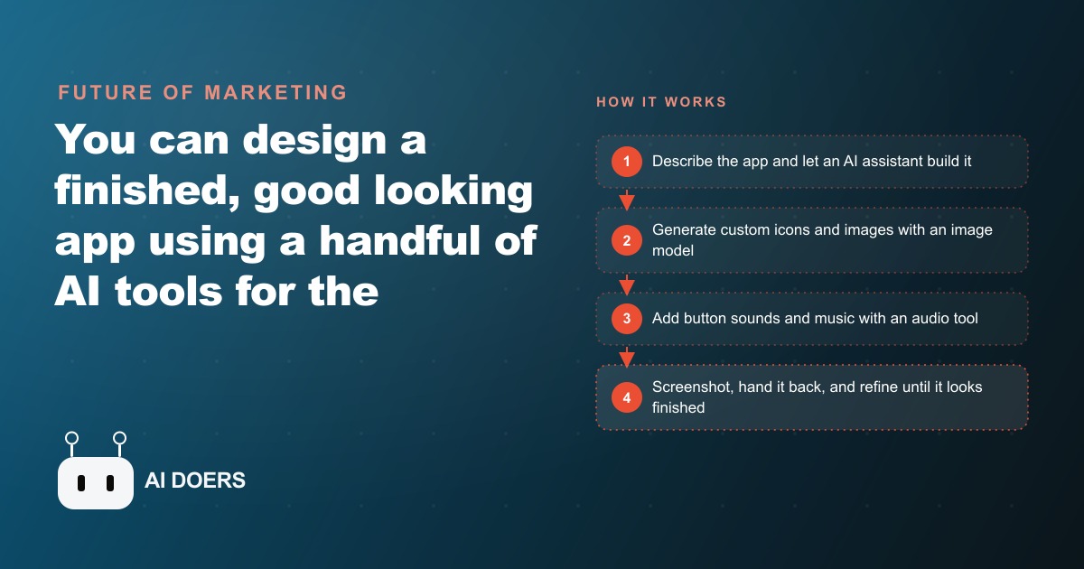
The gap between having a product idea and shipping something that looks genuinely finished has not been this narrow for a non-designer in two decades. A set of AI tools can now handle the layout, the custom icons, the images, and the audio of an app without requiring a design team, a development budget, or a single line of hand-written code.
Madhuranjan Kumar has been tracking this stack closely, and the shift matters not because it makes design cheap but because it makes design fast enough that a business can actually use it. Here is what changed, who it changes things for, and the concrete move worth making now.
The Skill Gap Between Having an App Idea and Shipping a Polished Screen Just Closed
Until recently, the path from "I want a booking screen that looks like us" to a finished, polished interface required a designer and a developer, a two-to-four-week timeline, and a budget that felt wrong for something as functionally simple as a scheduling screen. Most owners ran that calculation and stayed on a generic SaaS tool that almost fit.
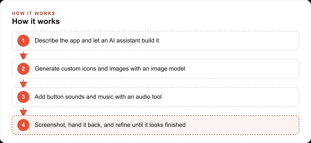
What changed is that three categories of AI tool matured in the same window. AI coding assistants that write and update app code from plain-language descriptions became accurate enough to produce real, usable interfaces. Image models became fast and clean enough to generate icons and graphics that look designed rather than generated. Audio tools became capable enough to produce button sounds and ambient tracks that make a screen feel alive rather than bare.
None of these categories is brand new. What is new is that all three are good enough at the same time, which means a single person with a description of what they want and four focused hours can produce something that would have required a team a year ago. The skill the owner brings is taste and judgment: knowing what looks right and what does not. The mechanical work of making it happen is now handled by the tools.
The practical effect is that a small business can build and ship one polished, branded tool without a development contract and without a design retainer. The barrier has moved from budget and team to clarity of description. If you can describe what you need in a few sentences and tell the difference between something that looks right and something that does not, you can direct the entire build.
The Screenshot Loop Is the Move That Changes Everything About the Design Iteration Cycle
The single most important shift in this stack is the screenshot feedback loop, and it is worth explaining precisely because it changes how iteration feels.
In a traditional design workflow, when something looks wrong, you describe the problem in words, usually by writing a comment in a shared document or explaining it to a designer on a call. Words about visual problems are imprecise. "The header feels too heavy" or "the button does not look aligned" are interpretations, not instructions, and they can produce ten rounds of minor revisions before the thing looks right.
The screenshot loop replaces that. When something looks wrong in the app, you take a screenshot and paste it back to the AI coding assistant with one short instruction: make this navigation bar narrower, or center this button, or reduce the text size here. The AI sees exactly what you see. There is no translation required. It corrects the specific thing visible in the image rather than interpreting a verbal description of it. The round trip from "that looks off" to "that looks fixed" compresses from a day to a few minutes.
This changes the psychology of iteration too. When fixes are fast and visual, you try more things. You push the layout a little further, test a different color, see how a different icon size feels. The cost of a wrong guess drops to near zero because the correction takes thirty seconds. That freedom to experiment without penalty is what produces the final version that looks genuinely finished rather than the version you settled for because another revision felt expensive.
For an owner with no design background, this also removes the worry about describing design problems correctly. You do not have to articulate the issue before you can fix it. You build something, see how it looks, take a screenshot, write one line about what is wrong, and watch it get corrected. The describing comes last, as a label for what you already decided was correct when you saw it on screen.
There is also a practical effect on confidence. Most owners who try to build a branded tool early on discover that the biggest obstacle is not the cost of the tools or the complexity of the technology. It is the fear of producing something that looks amateurish. The screenshot loop removes that fear because it guarantees that anything that looks wrong can be fixed before it goes anywhere near a customer. Every round of iteration shrinks the distance between what you are seeing and what you imagined the finished version would look like. By the time you stop iterating, the gap has closed enough that the result is something worth showing.
Custom Icons and Sound Are Not Optional Polish, They Are What Separates a Real Product From a Demo
There is a visible difference between an app that uses the default icon library and one that has a custom icon set, and most customers can feel it within a few seconds even if they cannot name why. Default icons signal that the design is a placeholder. Custom icons signal that someone made a deliberate decision about how the product looks. That distinction changes how a customer experiences the tool before they have done anything useful with it.
The same principle applies to sound. A booking app that plays a soft confirmation chime when a reservation goes through communicates something the same app with no sound cannot: that the action was received, it worked, and the product is attentive to the user's experience. Sound at its best is invisible. The customer does not think "there was a sound." They think "that felt right," and they are slightly more likely to use the tool again because of it.
For a service business, these details matter because every customer-facing tool is a touchpoint that shapes trust before the service is delivered. A client who opens a booking screen that looks like a demo will have a slightly lower baseline of confidence in the business than a client who opens something that feels designed specifically for them. Neither experience changes what the underlying service delivers. Both shape what the client expects before the appointment begins or the technician arrives.
Generating a custom icon set from an image model takes roughly ten to fifteen minutes. Generating a confirmation sound from an audio tool takes five. These are not large investments. They are the details that close the gap between something that works and something that feels finished, and that gap is almost entirely made of how the customer feels in the first three seconds.
An HVAC Company Has a Reason to Ship a Branded Booking App Before Next Month
Consider an HVAC company that books service calls through a generic scheduling link. The link works. Customers use it. But it carries no branding, no equipment-type selection, no service history, and no personality from the company about to send a technician into someone's home.
A vibe design session builds something different. The home screen carries the company logo and a brief welcome line. Below it, four icon buttons represent the four most common service categories: furnace tune-up, AC service, air filter replacement, and thermostat installation. Each icon is a custom illustration generated by the image model in the company's brand colors, not a stock symbol borrowed from a generic library. A third section shows the customer's service history with dates and technician notes.
When the customer books an appointment, the app plays a soft confirmation chime. It does not announce itself. It just signals, quietly, that the booking landed and the company received it.
The screenshot loop then runs: the spacing around the icons looks tight, so a screenshot goes back to the assistant with one short instruction. The header color reads slightly off on a phone screen, so another screenshot captures it with a one-line fix request. After two or three of these passes, the screen looks like something the company would be proud to show a client.
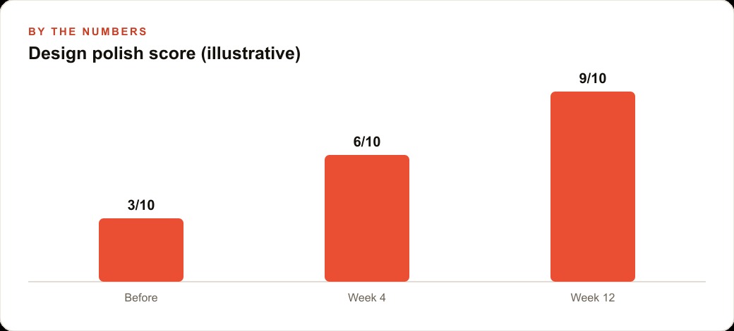
In illustrative terms, the whole design pass takes roughly four hours. The app carries all of the same scheduling function as the plain link, but the customer experience is qualitatively different. Branded, polished booking screens tend to produce measurably higher completion rates on the key action compared to plain scheduling links, in the range of ten to fifteen percent. For an HVAC company routing two to four service calls per day through digital channels, a twelve percent improvement in completion translates to roughly eight additional bookings per month that would otherwise have been abandoned at the confirmation step. At an average ticket of $150 to $200, that is between $1,200 and $1,600 per month in revenue that the plain link was leaving behind.
The First Screen Is the Investment, Every Screen After That Compounds
The most important thing to understand about vibe designing is that the difficulty is front-loaded. The first screen is where you figure out the tools, learn what the screenshot loop feels like, settle on the icon style, and make the twenty small decisions that define what the product looks like. That first screen takes an afternoon. It also produces everything that makes the second screen faster.
By the time the first screen is done, you have an icon set. You know how to write a screenshot instruction that produces a clean result. You know which model handles icon generation cleanly and which audio tool produces sounds in the right register for your brand. You have the color codes, the type sizes, and the spacing rules. The second screen uses all of that without rebuilding any of it. It takes an hour, not an afternoon.
The third screen takes less than an hour. The fourth takes thirty minutes. By the fifth, the design language is established and each new build is a refinement on a foundation rather than a decision about what the foundation should be. This is the compounding argument for starting now rather than waiting for a better moment.
For the HVAC company, the booking screen is the first screen and the hardest one. Once it is built, the service history screen comes from the same toolkit and takes a fraction of the time. The equipment information screen, the warranty lookup, the indoor air quality panel if the company has sensors: all of these become fast because the first screen established the design system. The investment is one focused afternoon. Everything after that runs on the foundation it created, and the product grows in scope without growing proportionally in effort. That ratio is what makes vibe designing worth starting, even when the first session runs longer than expected.
The business owner who builds five polished screens in the first quarter has an asset that compounds without additional design investment. Each screen is a completed tool the customer or team can use. Each one that gets used generates feedback about what to improve and what to add next. That feedback loop, design one screen, observe how it gets used, improve based on real behavior, is the same loop that produces good products in much larger teams. Vibe designing makes it accessible to one person in the gaps of a normal working week. The owner who builds with this stack is making a deliberate bet that polished tools retain customers, reduce churn, and generate word-of-mouth from clients who notice the quality, which is a bet that compounds invisibly over months and becomes very visible on the annual revenue report.
That is exactly what we do at AI DOERS. Book a private 30-minute call with Madhuranjan Kumar and we will map the fastest path to it for your specific business.
Book your call →
Madhuranjan Kumar
Madhuranjan Kumar brings 20 years of performance-marketing experience and has managed over $200 million in Facebook ad spend for brands across the United States and beyond. His expertise spans the full modern marketing stack: Meta, Google Ads, TikTok, email automation, CRM, and the websites that hold it together. At AI DOERS he turns that track record into lead-generation systems for businesses across every industry.