
Vibe Design: How the Figma MCP and shadcn MCP Hit Near Pixel Perfect UI
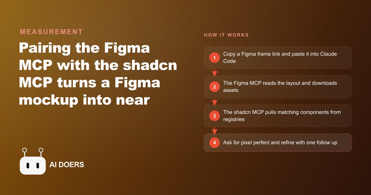
Pairing the Figma MCP, which reads frames and downloads image and SVG assets, with the shadcn MCP, which connects component registries and auto imports blocks, turns a Figma mockup into near pixel perfect UI in one or two prompts.

The translation tax between design and code has always been paid in developer hours. When a designer finishes a Figma mockup and hands it to an engineer, what looks like a clean handoff is actually the start of a conversion process nobody budgets for honestly. The engineer opens the file and starts hunting: what is the exact font weight on that heading? Is this logo an SVG or a PNG? What color is the button in its hover state? Where do the card margins come from? Each answer lives in the design tool, not the code, and pulling them across takes time. I have watched skilled front-end developers spend four to five hours on a single landing page, not because they lacked skill, but because the translation itself is that long when done manually. Multiply that across every page a project needs and every week a team ships, and the translation tax becomes one of the largest invisible costs in web development.
The Figma MCP and the shadcn MCP, used together inside Claude Code or Cursor, compress that translation to a handful of prompts. I want to explain how and why, because the fidelity improvement is not vague. It comes from something specific: the tools bring actual assets across the boundary instead of guessing at what those assets were supposed to look like.
The two tools and what each one brings
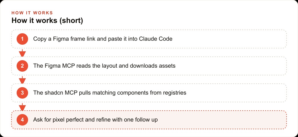
The Figma MCP connects your AI coding environment directly to a design file. You copy a frame link from inside Figma, paste it into a prompt, and the tool reads the layout properties, spacing values, type styles, and color definitions from the file itself. That alone is already useful. But the critical capability is asset download: the MCP pulls image assets and SVG logos straight out of the Figma frame and makes them available to the code generation step. The logo you placed in the header of the design is the logo that appears in the generated code. Not a text approximation of it. Not a blank box where it should be. The actual SVG.
To get started you need a Figma API key. In Figma, go to settings and navigate to security. Generate a personal access token with read access to your files, give it a long expiration so you are not rotating it every few weeks, name it clearly, and paste it into the MCP configuration. The whole setup takes about two minutes.
The shadcn MCP handles the component layer. Shadcn is a widely adopted system for building React UI with composable, styleable components, and the ecosystem around it has grown well beyond the defaults. There are registries with animation-focused components, polished data table layouts, chat interfaces, text editor blocks, and specialized patterns for nearly every UI scenario a designer might specify. The shadcn MCP connects your project to these registries and gives the AI three concrete capabilities: a searchable list of every component available across all connected libraries, the exact CLI command to install any of them, and working example code showing how to use each one. The AI does not have to guess which library to reach for or how to import a component. The MCP provides the precise answer.
One important installation detail: the shadcn MCP must be set up per project rather than globally, because it reads the component registries imported in your project's components.json file. A global installation cannot see those project-specific registries, so the component search results reflect defaults rather than the libraries you actually configured. Run the shadcn MCP init for your editor, then add registry URLs, each ending in `/r`, to your components.json file. Each URL is a new library the AI can search and pull from on demand.
Together the two tools create a closed loop. The Figma MCP brings design context and real assets. The shadcn MCP brings component infrastructure and real installation paths. The AI translates between them, and because it is working from real material on both ends, the translation is accurate.
Why asset download is the actual breakthrough
Before asset download existed as a feature in Figma integration tools, the fidelity gap between a Figma design and AI-generated code concentrated in three places: logos, product imagery, and custom icons. The AI could read a frame's layout and match its spacing reasonably well, but when it encountered a company logo, it substituted a text label or placed a blank box. When it encountered product photography, it placed a gray rectangle with roughly the right dimensions. When it encountered a custom UI icon, it drew a rough CSS approximation or used a generic alternative.
Those substitutions are what make AI-generated UI look like a wireframe awaiting content rather than a finished page. A page with a gray box where the logo should be communicates immediately that the work is not done, regardless of how accurate the layout is. Every asset that requires manual sourcing after the first render is another piece of the translation tax paid by hand instead of by the tool.
The Figma MCP resolves this by downloading assets as part of reading the frame. The SVG wordmark embedded in the design file comes down as a real SVG. The hero photography comes down as a real image. When the AI builds the page, it places real assets into their correct positions. The first render looks like the design, not a skeleton version of it.
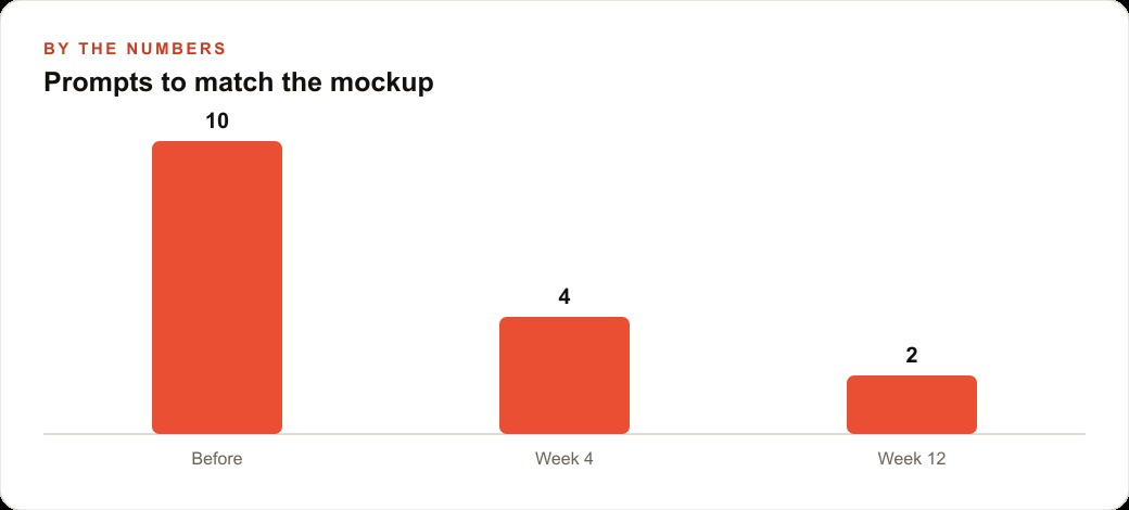
This is the breakthrough that closes the fidelity gap. Without it, AI-generated UI is a structurally accurate approximation that requires follow-up asset sourcing before it resembles the intended design. With it, the first render is near-complete, and the remaining work is fine-tuning spacing and shadow details rather than rebuilding the visual content from scratch. The number of prompts required to reach a deliverable result drops significantly.
Testing this across a range of Figma frames and AI coding environments, the pattern holds consistently: frames with real assets downloaded during reading produce first renders that a client would recognize as their design. Frames without asset download produce first renders that require corrections to every asset-heavy element before they are usable. That is not a marginal improvement. It is the difference between a working draft and a wireframe.
Registries and the component library as creative infrastructure
The component model in shadcn is built on registries: collections of components hosted at a URL, importable by any project that adds that URL to its configuration file. The shadcn MCP makes this practical by letting the AI search across multiple connected registries simultaneously, identify the component that best matches a design requirement, and retrieve the installation command without the developer manually hunting through documentation.
The creative possibility this opens is worth understanding clearly. Registries are not mutually exclusive. A project can pull an animated entrance component from one library and a polished data table from a second and a rich text editor from a third. The AI searches across all of them in the same session, selects the right component from wherever it is best implemented, and the developer imports using the exact command the MCP returned. A designer who specified a page with smooth content reveals, a sortable listing grid, and a contact form with inline validation does not have to find one library that has all three at the quality level the design demands. The components come from wherever they are best built, and the AI assembles them into a coherent page.
This same model is how private registries work and why they become a compounding asset over time. After the first project for a brand, the custom components built for that brand, specific button styles, card patterns, navigation bars, and contact form layouts, can be extracted and published to a URL the team controls. Every future project for that brand adds that URL to the components.json file. Every brand component is immediately available without rebuilding. The first project does the design-to-component conversion work once. Every project afterward inherits it automatically, and the work compounds rather than resets.
A real estate brokerage: from mockup to on-brand in two prompts
Real estate is a category where design fidelity has a direct financial consequence before anyone picks up a phone. A potential buyer or seller who lands on a brokerage's property listings page makes an unconscious quality judgment in the first few seconds. A page that precisely matches the brand, with the correct logo, the actual photography, and the right color system, communicates professionalism. A page with a placeholder logo, mismatched spacing, or a generic accent color communicates inattention, and the prospect back-clicks.
Say a brokerage's designer delivers a Figma file with four sections: a hero featuring a signature listing, a grid of active properties with agent attribution below each card, a compact agent profile block, and a contact form at the bottom. The design uses the brokerage's actual SVG wordmark, a palette built around the brand's navy and gold, and real photography of a featured property.
I copy the frame link for the hero into Claude Code with a prompt to implement it to match the design. The Figma MCP reads the layout and downloads the SVG wordmark and the featured property photography directly from the design file. The shadcn MCP connects to registries where polished property card components and subtle hover animations live. In one or two prompts, the hero is built with the real logo in place, the real photography positioned correctly, the correct color values applied throughout, and the spacing matching what the designer specified.
The gap between the design and the code at this point is shadow adjustments and a margin correction. Not a missing logo. Not a wrong-branded button. Not a placeholder rectangle where a home should be. The client looks at the first render and recognizes their brand immediately, because it is genuinely their brand. That recognition happens at first prompt rather than after three rounds of asset corrections.
The listing card grid, the agent profile block, and the contact form follow the same pattern: each section is implemented from its frame link with real assets and the right registry components. By the time all four sections are done, the brokerage has a live page that matches the mockup closely enough that the designer approves it without significant rework.
Building a private registry as a compounding investment
After that first project, the right move is to spend an hour or two extracting the brokerage's custom components into a private registry. This step is the one most people skip, because the benefit is invisible until the second project begins. I want to be specific about what that benefit actually is.
Every brand has a set of recurring UI patterns: buttons, cards, navigation bars, form fields, testimonial blocks, contact forms. In a traditional workflow those patterns are rebuilt or copied with minor variations each time a new page is created. Inconsistencies accumulate. A button on the listings page ends up with slightly different padding than the button on the agent directory. The card on one section has a different border radius than the card on another. After a year of normal development the site has visual drift that nobody decided on but that everyone contributed to.
A private registry eliminates this by making the brand's components the default raw material for every new task. When I prompt for a new page, the AI pulls from the registry first. The button is the correct button. The card is the correct card. Consistency is built into the starting point rather than enforced through review and correction after the fact.
For a brokerage that publishes new neighborhood pages, agent profiles, and seasonal campaign pages throughout the year, a private registry built after the first project multiplies the speed and quality of everything that follows. The third page takes meaningfully less time than the first, and the tenth takes less again, because the registry has accumulated component work from every previous project rather than resetting each time. This is not a productivity feature in the usual sense. It is infrastructure. You build it once and it pays off across every project for that brand indefinitely.
What the ceiling actually looks like
The best results from this workflow come when the Figma design was built using shadcn-based components from the start, and when those layers carry descriptive names that correspond to components in the connected registries. When a card layer in Figma is named "ListingCard" and that name matches a component in the shadcn registry, the AI makes the connection directly. When a layer is named "Group 47" and the visual is an unlabeled rectangle, the AI still reads the visual properties accurately and downloads the real assets, but the component selection relies on inference rather than direct match.
This is not a failure of the tools. It is how translation works when source and target share a common language to varying degrees. The tighter the alignment between the design system and the component system, the more precise the translation. When a designer and a developer work in a shared component vocabulary from the beginning, the two MCPs become near-perfect translators between the two representations of the same UI.
For projects where the design was built without regard to the component system, the workflow still delivers a strong result. Asset download works regardless of layer naming. Layout reading works regardless of component alignment. The first render is meaningfully better than a description-only approach. But the fidelity ceiling is lower, and closing the remaining gap requires more prompt iterations than it would on a design built with the component vocabulary in mind.
The practical guidance is straightforward. If starting a new project, design it in Figma using shadcn-based components with descriptive layer names. The component vocabulary becomes a shared language between design and code, and the two MCPs translate between them with high accuracy. If retrofitting an existing design, expect strong results from asset download and layout reading, with less precise component match on complex interactive elements.
The translation tax between design and code has not disappeared entirely. It has been compressed from several hours to tens of minutes. What used to require hunting for assets now happens in the first render. What used to produce inconsistency now accumulates into a registry that grows more useful with every project. That compression is real, measurable, and worth building a workflow around.
That is exactly what we do at AI DOERS. Book a private 30-minute call with Madhuranjan Kumar and we will map the fastest path to it for your specific business.
Book your call →
Madhuranjan Kumar
Madhuranjan Kumar brings 20 years of performance-marketing experience and has managed over $200 million in Facebook ad spend for brands across the United States and beyond. His expertise spans the full modern marketing stack: Meta, Google Ads, TikTok, email automation, CRM, and the websites that hold it together. At AI DOERS he turns that track record into lead-generation systems for businesses across every industry.