
The Claude UI Workflow: One Prompt to a Real Next.js App
Design first and code second. Have Claude generate every page as a single horizontal HTML mockup, refine it with reference screenshots, then convert the approved design into a working Next.js app by planning a minimal component list and building one piece at a time.

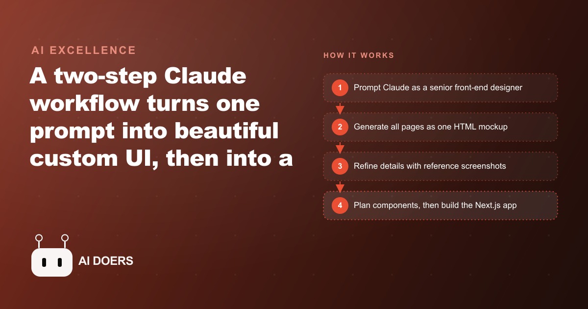
For a long time my honest answer to the question of whether AI coding tools could produce a genuinely good-looking custom interface was: not reliably. Functional, yes. Polished and custom-feeling, rarely. That answer has changed, and the workflow that changed it is specific enough to walk through step by step. The steps matter in sequence. Skipping any one consistently produces a worse result than following the order correctly, and the gap between following the sequence and improvising it is surprisingly large in the final output.
The core move is sequencing the creative work before the engineering work. Generating a finished application first produces something functional but generic, because the model defaults to the most common visual patterns it has seen and treats layout and aesthetics as secondary to making the code run. Separating the design phase from the build phase forces a dedicated creative pass before any technical constraints come in. That one change produces a dramatically better interface, and the economic impact of a better interface on a service business is direct and measurable. Here is exactly how the workflow runs.
Write the design brief before you open any editor
The first move is not to open a code editor or start a conversation with an AI. It is to write a brief that answers four questions: what is the interface for, who is the primary user, what single action should the interface drive, and what is the visual tone. These do not need to be long answers. A sentence each is enough. But writing them down before starting means the prompt you write next is driven by a clear intent rather than improvised as you go.
The brief also gives you a standard to evaluate the first draft against. Without it, the tendency is to accept whatever the AI produces as long as it looks reasonably professional. With a brief, you have a specific check: does this interface clearly drive the primary action, and does it carry the right visual tone for the user I described? Those two questions cut through a lot of the vague dissatisfaction that comes from evaluating AI-generated design without a clear goal. The brief takes five minutes and saves multiple rounds of unhelpful iteration later.
Prompt as a senior designer with every technical constraint spelled out
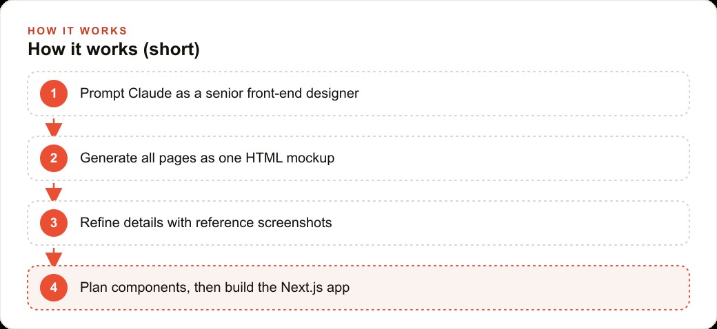
The initial generation prompt carries the design brief and adds every technical constraint explicitly. The constraint layer is what most people skip, and it is the primary factor that separates a specific and useful output from a generic one. The prompt should name a visual style or aesthetic direction, specify the page size in pixels so the agent renders to the right canvas, identify an online vector icon library so the icons have a consistent style rather than the agent improvising a mix, name an open image source for photographs, and ask explicitly for all pages to be output in a single HTML file with a horizontal layout showing them side by side.
The role framing matters too. Addressing Claude as a senior front-end developer with a specific named design style, rather than simply asking for a UI, shifts the frame of reference the model uses for quality decisions and visual choices. A senior designer makes deliberate choices and can explain them. An undirected AI tool makes whatever is most common and requires the least decision-making. The senior designer framing consistently moves the output toward the specific and away from the generic.
Stating every constraint explicitly removes a large source of variation from the first draft. Fewer decisions left to the model means fewer unexpected choices to correct after the fact, and the corrections you do need to make are smaller and easier to describe.
Generate the first two pages only to validate the direction before going wide
The instruction to generate all pages at once is a trap. When the first full set of pages comes back with a visual direction you want to adjust, the correction cost is proportional to how many pages were generated in that direction. Generating only the first two pages first, typically the main landing view and one key secondary page, lets you evaluate the visual direction, the tone, and the core layout decisions before committing to a full set.
If the direction is right, continue to the remaining pages. If something is off, correct it now with two pages rather than correcting it across ten or twelve. The correction cost is roughly constant regardless of how many pages carry the problem, which is why validating the direction before going wide saves time consistently across every project. The feedback you give after reviewing the first two pages is also more specific and confident, because you have seen the actual direction rather than imagined it from a description.
Feed a reference screenshot, not a text description of a style
Text descriptions of visual style are unreliable inputs. Words like clean, modern, minimal, professional, and premium each apply to hundreds of different aesthetics, and the model's interpretation of them varies considerably. A screenshot of an interface you admire is unambiguous. The model can match a specific visual style from a reference image far more consistently than it can interpret a text description of a feeling.
The reference screenshot does not have to match the project domain. A screenshot of a luxury hospitality booking interface can inform the visual tone of a medical booking page, even though the businesses are completely different. What transfers is the typography scale, the spacing decisions, the color palette approach, and the overall visual weight. Finding a screenshot that captures the feeling you want and attaching it to the prompt takes thirty seconds and consistently produces a first draft that requires less refinement than any text-only description would generate.
Edit precisely by attaching a screenshot of the exact problem
When a specific detail is wrong, the most efficient correction is to screenshot exactly that area and describe the specific fix in precise terms. A label that is not vertically centered, a button that sits too close to the edge of its container, a spacing gap that is inconsistent with the rest of the layout: screenshot the problem area and describe the change needed.
This produces an edit to the specific area without regenerating surrounding elements that were already correct. The alternative, describing the problem in words without a visual reference, often triggers a broader regeneration that fixes the described issue while introducing new ones in areas that were already right. The screenshot plus precise description keeps the correction surgical. It also keeps the overall conversation short because the model has the visual context it needs to understand the problem immediately, rather than inferring what to change from a text description alone.
Add motion only after the static layout is approved
Animations applied to a layout that is still changing break repeatedly and slow down the whole project. The correct sequence is to lock the static layout completely, including every spacing decision, every type size, and every element position, before adding any hover states, transitions, or interactive motion.
Once the static layout is approved and feels right, adding motion is a contained and fast task. The instruction is simple: keep the existing layout exactly and add hover and interaction animations only, without modifying anything else. That constraint, stated explicitly in the prompt, prevents the model from using the animation request as an opportunity to make other visual adjustments it might want to make. Motion is the final layer on a stable structure. Introducing it while the structure is still being shaped creates instability that costs more time to resolve than the motion itself is worth.
Plan the component list before generating any files
The planning step between the approved design and the build phase is the most commonly skipped and the most consequential for the quality of the finished application. When someone sees the approved static design and wants to see it working, the temptation is to go straight to generating code. The result is a codebase that does not match the mockup's component structure, which requires either expensive rework or accepting a finished application that diverges from the approved design in ways that are difficult to explain to anyone who reviewed and approved it.
Before generating any code files, ask the model to review the approved design and plan the minimum set of UI components needed to build it, describing the folder structure and naming convention for each. Ask explicitly for a plan only, with no file generation yet. This step forces the model to think about the component architecture before it starts producing files. It surfaces decisions that are cheap to resolve in planning and expensive to resolve mid-build: should these two cards be one component or two, does this navigation belong in the layout wrapper or a separate context provider, where does the shared color logic live. Answering those questions in five minutes of planning saves hours of restructuring later.
Save the resulting plan to a file called plan.md so both the model and any human overseeing the build have a clear reference for what the build is supposed to produce. The plan is the contract between the design phase and the build phase.
Build one component at a time and check it off the plan
With the plan in place, the build phase becomes methodical and predictable. Scaffold the Next.js project with Tailwind, then build one component from plan.md at a time, starting with the top-level layout wrapper and working inward. After each component is built, check it off the plan before moving to the next one.
The check-off habit matters because it keeps both the model and the person overseeing the build oriented to the same progress state. Without it, the build can drift toward completing easy components first and leaving complex ones until the end, which produces a false sense of progress. Building one component at a time also produces better individual components than building multiple in parallel. The model's attention is on one element, and the output reflects that focus. Building the booking card before the confirmation screen, completing the navigation header before the treatment detail section, and checking each off as it is finished produces a codebase where each piece is complete before the next begins. The result matches the approved design at each stage rather than being a collection of partially built elements that all need further work to be usable.
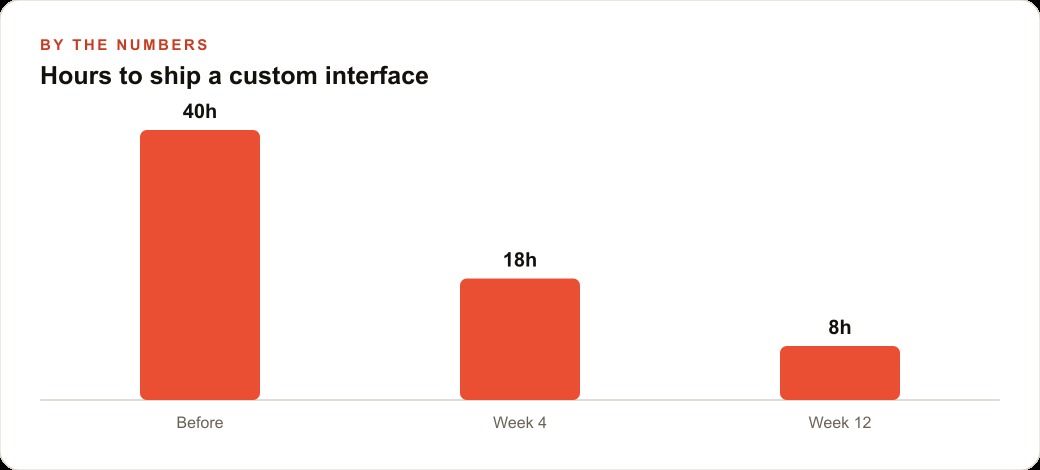
The full sequence from brief through design approval to component build typically takes two to three days for a client-facing tool. That is the timeframe for a custom-feeling result rather than a template-based one, and the difference in interface quality has a direct effect on the revenue the tool generates.
The med spa example: what better interface quality is actually worth
A medical spa booking page built using this workflow illustrates the economic case for investing in interface quality. The default for most med spas is a booking page that looks like a generic scheduling tool, which is what you get when you build directly to functionality without a dedicated design phase. A page built using the design-first workflow, with a reference screenshot from a luxury hospitality site and specific prompting toward a calm premium aesthetic, produces an experience that feels consistent with the quality of the in-person treatment rather than disconnected from it.
The difference in conversion rate between a generic booking page and a premium-feeling one on the same traffic is substantial. An industry standard conversion rate for a generic med spa booking page is around 8 percent of visitors who reach the page. A well-designed page that matches the expected quality of the experience consistently reaches 15 percent or better on comparable traffic. For a practice with 3,000 visitors per month reaching the booking page, the difference between 8 and 15 percent is 210 additional appointments per month. At an average treatment ticket of 200 dollars, that is 42,000 dollars in additional monthly revenue from the same traffic volume, driven by a better interface rather than more advertising.
The cost of building the interface using this workflow is a few days of focused work and a tool subscription in the range of 20 dollars per month for the AI model. The economic case for investing in that work rather than accepting a generic template is not close once the conversion rate difference is measured. Most owners accept the generic template because measuring conversion rate by interface quality requires running the experiment, and running the experiment requires having an alternative to test against. The design-first workflow produces that alternative in days rather than weeks, which makes running the experiment practical rather than aspirational.
Why the planning step matters more than the design step
The component planning step between the design phase and the build phase is the single most consequential part of the workflow for the long-term quality of the application. Most people treat it as an optional optimization. It is not. The design phase determines how the application looks. The planning step determines whether the code that produces that look is maintainable, extensible, and consistent with the approved design at every stage of the build.
A build that skips the planning step produces a codebase where components are structured around whatever was easiest to generate rather than around what the design actually requires. That structure is hard to maintain because the components do not map to the design's actual visual units. Adding a new page or a new variant requires understanding how the existing components were assembled rather than following a clear component map. The planning step is what makes the finished codebase a foundation to build on rather than a collection of outputs to work around.
The discipline of asking for a plan only and explicitly withholding permission to generate files is also what makes the planning step work. When the model is allowed to generate files at the same time it plans, it defaults to generating what is easiest rather than what the design requires. Separating the planning from the generation, the same way the design phase is separated from the build phase, produces better architecture for the same reason it produces better design: a dedicated thinking pass before the execution pass consistently outperforms an improvised combination of both.
That is exactly what we do at AI DOERS. Book a private 30-minute call with Madhuranjan Kumar and we will map the fastest path to it for your specific business.
Book your call →
Madhuranjan Kumar
Madhuranjan Kumar brings 20 years of performance-marketing experience and has managed over $200 million in Facebook ad spend for brands across the United States and beyond. His expertise spans the full modern marketing stack: Meta, Google Ads, TikTok, email automation, CRM, and the websites that hold it together. At AI DOERS he turns that track record into lead-generation systems for businesses across every industry.