
From Screenshot to a Live Landing Page in Under 20 Minutes With AI
AI tools now let any business turn a reference screenshot into a clean, converting landing page on its own domain in one short sitting.
Forty-seven email addresses in a single month, from a page that cost twelve dollars and one afternoon to build. That is the result a local coffee shop owner walked away with after deciding her printed punch card and an Instagram bio were not enough of a foundation for a durable customer relationship. This is the story of how that page got built, chapter by chapter, because the process itself is the lesson.
The afternoon the owner decided what the page needed to do
The shop had been open for three years. It had a consistent morning crowd, an order-ahead weekend rush, and an Instagram following of several hundred people who reliably engaged with posts about latte art and seasonal roasts. The owner knew those followers lived on borrowed ground. The platform could reduce her access to them at any time, for any reason, without notice. Three algorithm changes in twelve months had made that abstract risk feel very concrete.
She wanted an email list. Not a long newsletter with multiple sections and link roundups. Just a direct line to people who had said yes to hearing from her when something worth sharing happened. A new Ethiopian single-origin roast landing next week. A slow Tuesday morning deal starting at six. A private tasting event for twenty regulars. The channel she wanted was one she owned outright, where no platform decision could reduce her reach without her knowledge.
The page had one job, and she had done the hard thinking before opening any tool. That clarity is what made everything else move quickly. A page with a single defined outcome converts at meaningfully higher rates than one trying to accomplish several things simultaneously, because there is nothing competing with the one action you want visitors to take. She decided the incentive would be a free pastry on the first visit after signing up. Tangible, easy to deliver, and worth enough to motivate a quick yes from someone who already liked the shop.
A detail worth naming: she spent about thirty minutes writing down exactly what the page needed to include before she typed a single prompt. The hero headline. The story section length. The number of menu highlights. The exact wording of the offer. That preparation meant the first generation came back close to the target rather than somewhere vague, and every minute spent clarifying before opening the tool saved five minutes of confused iteration after.
Finding a reference worth copying
She spent about twenty minutes browsing coffee and food brand sites, not looking for something to replicate wholesale but for the visual temperature she wanted the page to have. She found it on an artisan roastery based in another city, one whose page used warm cream tones, rounded soft elements, a hero photo of a steaming cup on a wooden table with morning light coming in from the side, and a headline that led with sensory language rather than a discount or a feature list.
She took a screenshot of the top third of that page. Just enough to communicate the mood: the color relationship between the background, the text, and the accent elements. That screenshot became the reference the AI design tool would use to understand what warm and welcoming actually looked like, because those words typed as description produce something generic. A picture communicates what they mean in practice.
The reference did not need to be from a direct competitor or even a coffee brand. It just needed to show the visual register she was after. An AI design tool uses a reference image to understand tone and proportion, not to copy specific layout elements. Any page with the right mood and the right color temperature would have served the same function. The time spent finding a good reference is paid back immediately in the quality of the first generation.
What came out of the first generation
She opened an AI design tool and wrote her prompt clearly. A loyalty signup landing page for a local coffee shop. Warm and inviting, like a neighborhood spot rather than a chain. A hero headline about freshly roasted small-batch coffee. A short two-sentence story section about the shop. Three coffee highlights shown simply, as reasons the coffee is worth caring about rather than a product catalog. One clear call to action: join the rewards list and get a free pastry on the first visit. She attached the screenshot.
The tool returned a full working page in about thirty seconds. The structure was correct: a large hero area, a short story section below it, a row of three highlights, and a call-to-action section with a button. The colors were in the right territory but slightly too cool and too clean. The fonts were readable but had a digital-product feel rather than the warmth of a neighborhood shop. The button was a standard rectangle with ordinary proportions.
None of those were problems worth stopping for. The structure was sound, and that is the genuinely hard part of a landing page. Color, font weight, button shape, and copy tone all respond to short, specific follow-up requests. The first generation was a starting point, not a finished product. Treating a first generation as a finished product is the mistake that produces a page that functions adequately but lacks the specific personality that makes visitors feel they have landed somewhere real.
The iteration loop: five requests over fifteen minutes
Most people look at the first generation, decide it is not quite right, and either accept it as is or abandon the process. Both responses miss the point. The first generation is a foundation. Refinement is conversational and fast, and the distance between a serviceable first draft and something the owner would be proud to share is usually five to eight short, specific requests.
The owner made five over about fifteen minutes, each one targeting a single specific issue.
First: shift the background toward a warmer cream, less white and more in the direction of the reference screenshot. The tool adjusted the palette across the entire page in one response.
Second: make the call-to-action button corners more rounded and increase the text size inside it by one step. The button became a pill shape with better visual weight and more presence on the page.
Third: the hero headline is too neutral. Lead with the sensory experience of the coffee, what you notice when you walk in before you even order, not a generic brand tagline. The heading rewrote to something with real physical warmth.
Fourth: the story section is too long. Cut it to two sentences that sound like the owner talking, not a brand performing. The block shortened and the register shifted from promotional to personal.
Fifth: the menu highlights feel like a product catalog. Make them feel like three reasons the coffee is worth seeking out, each with a small relevant icon and a single line of context underneath. The section restructured from transactional to editorial.
After those five exchanges the page was genuinely good. Something the owner would have paid several hundred dollars for from a designer and then waited a week to receive. The total time for the iteration loop was fifteen minutes, and every change appeared in preview immediately without waiting for a revision cycle. The critical discipline was specificity: each request named one thing, described the problem with it, and said what the replacement should feel like. Vague requests produce vague revisions. Specific requests produce specific results.
Building a logo from the palette already on the page
The shop had a loose visual identity: two main colors used on printed menus, a warm cream and a deep espresso brown, and some hand-lettered text from an older design file the owner liked. No clean digital logo. Rather than commissioning one, she built one from what the page had already established.
She pulled the two hex codes from the page palette, opened a free image generation tool, and asked for a minimal flat cup icon using only those two colors, no gradients and no drop shadows. The result came back in one generation. She removed the background using a free online tool, saved the transparent PNG, and placed it in an images folder beside her project files.
She went back to the design tool and told it the logo file was at that path and asked it to place the image in the top left of the header at a proportional size. The logo appeared.
That sequence, generating the icon, removing the background, and placing it in the header, took eleven minutes. The logo cost nothing and matched the page without any adjustment because it was generated from the same two colors the page was already using. It looked like it had always been part of the design.
The branding step matters more than it might seem. A page without a logo reads as a generic template or a form page. A page with a clean matched logo in the header reads as a real business, and that first impression affects whether a visitor decides the offer is worth trusting. The logo is not decoration. It is a credibility signal.
Setting up the form that turned the page into a business tool
A page without a form is a brochure. The visitor reads it, appreciates it, and closes the tab, leaving nothing behind. The form is what converts a well-designed page into a business asset, and setting one up took about eight minutes.
She chose a free form service with no monthly fee and no per-submission cost up to a generous volume limit. The form asked for two fields: a name and an email address. Nothing else. Shorter forms convert better, and the only information she needed to start a relationship was a name for the greeting line and an address to send to. Every additional field she considered asking for, coffee preference, favorite drink, birthday, was a reason someone might stop filling in the form and leave.
She connected the form to a free email marketing account she had created years earlier but rarely used. She sent a test submission, watched the dummy contact appear in the list immediately, deleted it, and sent the test again to confirm the connection was reliable.
That confirmation moment, the test submission showing up in the email account, is the point where the page becomes a real business asset. A form connected directly to an email marketing account means every new signup is immediately available in a list she can write to from any device at any time, at no cost per email up to the free tier limit. No spreadsheet to export, no manual import, no delay between signup and availability. The infrastructure for a durable customer relationship was in place, and its ongoing operating cost was zero.
Going live: one purchase, two DNS records
She bought a domain with the shop name from a registrar for eleven dollars and ninety-nine cents. That is the full monetary cost of the build, outside of her time.
The deployment platform published the page to a temporary subdomain with one click. She logged into the domain registrar and added two DNS records: a CNAME pointing the www version of the domain at the platform hosting address, and an A record pointing the root domain at the same place. Both records propagated within about twenty minutes.
Before sharing the link, she opened the live page on her phone. Mobile traffic makes up the majority of visits for most local businesses, and a page that looks right on a desktop can have text that is too small, buttons that are too close together, or a form that is awkward to fill out on a small screen. She found one section that felt cramped at mobile width, described it in a single follow-up to the AI tool, and it adjusted the layout. She redeployed, checked again on her phone, and shared the link.
The mobile check is the step most people skip because the desktop preview looks good. Skipping it reliably costs conversion rate on the traffic that matters most. Spending five minutes on it before going live is five minutes that pays back every week the page is live.
Month one: forty-seven signups and what they represent
She added the link to her Instagram bio, placed a small printed card at the counter with the domain on it, and mentioned it in a story once a week. No paid ads. No cross-promotions. No aggressive push. Just the link, in the places where people who already liked the shop could find it without any friction.
By the end of the first month she had forty-seven new email addresses from people who had actively chosen to sign up. She sent one email that month, announcing a new Ethiopian single-origin roast she was stocking for a limited run. Twenty-one people opened it. Nine came in within the following week and mentioned the email when they ordered.
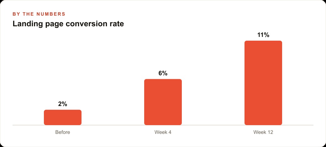
The page conversion rate in the first few weeks was around eight percent of unique visitors. That reflects what a focused page with a single clear offer produces when nothing on the page competes with that offer for the visitor's attention. A homepage with navigation links, multiple sections, and several calls to action will consistently convert at a lower rate because every option the visitor can take reduces the probability of the one option you actually want them to take.
Forty-seven signups in a month from a page with no ad spend is not a viral number. It is a real one. Those forty-seven people opted in to a direct channel. No algorithm sitting between the shop and the reader. No platform deciding which posts to surface on which day. When the next seasonal roast arrives, when a quiet Tuesday morning needs filling, when there is a private tasting to announce, the owner opens the email tool and writes. That capability, built in one afternoon for twelve dollars, compounds quietly for as long as the shop keeps adding to the list.
Madhuranjan Kumar's consistent observation on this: the businesses that build owned channels now, while most competitors are still treating social platforms as the primary customer relationship layer, are building a structural advantage that grows harder to close with every passing month. The infrastructure to build that channel is now available in an afternoon, to any business owner willing to spend thirty minutes thinking clearly about what the page needs to do before they open the tool.
That is exactly what we do at AI DOERS. Book a private 30-minute call with Madhuranjan Kumar and we will map the fastest path to it for your specific business.
Book your call →
Madhuranjan Kumar
Madhuranjan Kumar brings 20 years of performance-marketing experience and has managed over $200 million in Facebook ad spend for brands across the United States and beyond. His expertise spans the full modern marketing stack: Meta, Google Ads, TikTok, email automation, CRM, and the websites that hold it together. At AI DOERS he turns that track record into lead-generation systems for businesses across every industry.