
How to Turn a No-Code Web App Into a Real iOS App in One Prompt
Export your web app's code from v0, Lovable, Bolt, or Replit, zip it, and ask Claude to convert it into a React Native build prompt. Paste that prompt into a mobile builder, add brand assets and AI chat with plain language, and publish to the App Store, all without writing native code.

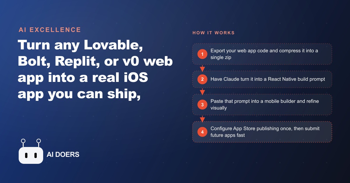
The wall between a working web app and a shippable iOS app has effectively collapsed, and the conversion now fits into an export, a zip, a Claude prompt, and a paste.
Mobile captures ten times more attention than a browser tab on the same device
The gap between web traffic and mobile app engagement is one of the most consistently documented patterns in consumer behavior research. People use mobile apps over ten times more than browsers while they are on their phones. That ratio holds across categories: shopping, learning, fitness, entertainment, productivity. When someone opens a phone, they navigate to apps on the home screen. The browser is where they go when no app exists for what they want. A business that has only a website is dependent on users remembering to open the browser and navigate to a URL. A business with a home-screen app earns a position in the daily routine without asking for it.
That difference matters commercially because retention drives revenue more than acquisition in most business models. It is cheaper to keep a customer who is already engaged than to acquire a new one. A home-screen app with the ability to send a push notification is the most direct path to staying in front of a customer without paying for another impression. A well-timed notification that brings a customer back to complete a course, confirm an appointment, or check a new product listing earns revenue that would otherwise require a paid ad to recover.
Millions of people now build web apps with tools like Lovable, Bolt, Replit, and v0. The validation step, getting the idea working in a browser, is more accessible than it has ever been. The mobile step used to be where most of those products stalled, because a web developer and a mobile developer are not the same person, and hiring native iOS development was prohibitive for most small businesses. That barrier has now collapsed in a way that is specific and worth walking through in detail, because the details are what make the workflow reliable.
The export step has a silent gotcha that kills the conversion before it starts
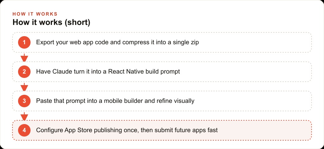
The first step in converting a web app to a mobile build is getting the code out of whatever no-code builder you used. Lovable, Bolt, Replit, and v0 all have export options, typically in the three-dot menu or the project settings. Clicking export downloads the code as a file you can hand to an AI agent for conversion. This is straightforward for most builders.
The silent gotcha is in how v0 handles exports. While Lovable, Bolt, and Replit download a zip file directly, v0 downloads a folder. Most people see a folder in their Downloads directory and upload it to Claude or their mobile builder. That upload fails because the tool expects a single file, not a folder. Claude interprets an uploaded folder differently than an uploaded zip, and the conversion prompt produces confused or incomplete output as a result.
The fix is one extra step: after downloading the v0 export folder, right-click it and choose Compress on Mac, or use the Windows equivalent. This wraps the folder contents into a single zip file that uploads correctly. It takes ten seconds and is the difference between a clean conversion and a frustrating troubleshooting session where everything looks like it should work but does not.
The broader lesson is to confirm the export contains what you expect before uploading it anywhere. Unzip the file and scan the contents. You should see the component files, the styling files, and the configuration files from your original web project. If the zip contains only a single HTML file or only a build output, the export captured the wrong thing and you need to re-export from the source.
Claude reads your code and produces a build prompt, not the finished app
This distinction matters enough to state precisely before going further. When you upload your web app's code to Claude and ask it to convert the app for mobile, Claude does not produce the finished iOS app. It produces a detailed, well-structured build prompt that you then paste into a dedicated mobile builder. That mobile builder, which is essentially an AI coding agent specialized for React Native mobile apps, does the actual construction work.
The reason for this two-step process is that Claude is a text and code understanding model, not a mobile development environment. It reads your web code fluently, understands the component structure, the styling approach, the data flow, and the navigation patterns, and it translates that understanding into instructions that a mobile builder can execute. The quality of those instructions determines the quality of what comes out of the mobile builder, and that quality is very high when you write the input prompt correctly.
The instruction to give Claude is: convert this web app into a realistic React Native mobile app and think like a mobile designer. That second phrase matters. It tells Claude to adapt the design for touch targets and phone screen proportions rather than literally translating every desktop layout decision. A navigation bar that spans the top of a wide web page becomes a bottom navigation bar on a phone, because thumb reach is limited. Claude makes those adaptations when the prompt asks it to think like a mobile designer rather than just copy the structure.
The output you receive is a comprehensive prompt describing the app's screens, components, navigation, styling, and data requirements in terms a mobile builder understands. Copy that output in full and paste it as the first prompt in a new mobile builder project.
One well-written prompt from a mobile builder carries the whole design across
The result of pasting Claude's output as the first prompt in a mobile builder is frequently impressive enough to surprise on first encounter. One prompt produces a mobile app that mirrors the structure, styling, navigation, and content organization of the original web product. The styling cards carry across. The how-it-works section appears with its correct steps. The pricing tiers show the right numbers. The button labels match the originals. The color scheme follows the web version.
This fidelity happens because Claude's prompt is detailed enough to specify all of those elements explicitly. A vague prompt produces a generic mobile template with placeholder content. A prompt generated from reading the actual source code contains the real content, the real structure, and the real design decisions, because it was derived from them.
From this first output, refinement is visual and fast. The mobile builder's select tool lets you tap any element in the preview and describe the change you want. Make the heading larger. Move the call-to-action button higher on the screen. Change the background color of the feature section to match the brand. Each instruction takes a sentence and the builder applies it without requiring any code editing. The iteration speed means a round of visual refinements takes 20 to 30 minutes rather than a day of development work.
The refinement phase is where personal taste and brand alignment get added. The first prompt carries the structure across correctly. The refinement phase makes it feel right for the specific audience and use case. Spending time here rather than skipping straight to App Store submission is what separates a finished product from a rough prototype.
Brand assets and sound enter the app through plain language, not code
Adding your logo, product images, background graphics, and sound effects to the mobile app does not require editing any file directly. The mobile builder accepts brand assets as files dropped into the prompt, with plain-language instructions describing where and how to use them. Drop in the logo file and say: use this as the app logo in the top-left corner of the navigation bar. Drop in a product hero image and say: use this as the header image on the home screen. Drop in a sound file and say: play this sound when the user taps the Start Free Trial button.
The builder interprets those instructions and wires the assets into the correct locations in the code without you touching any configuration file. The sound instruction is particularly useful because audio feedback is a mobile convention that has no direct equivalent on the web. A completion chime when a user finishes a lesson, a success tone when a payment is confirmed, or a notification sound when a new message arrives are all details that make an app feel native rather than like a website wrapped in a mobile container.
Brand consistency in a mobile app matters more than many people realize when they build the first version. A logo that appears at the wrong size, in the wrong position, or with the wrong background makes the app look unfinished. A color scheme that is slightly off from the web version creates a discontinuity that signals low production quality to users who have seen both. Spending the refinement session on brand consistency, getting the logo placement right, confirming the color values match exactly, and checking the typography against the web version, pays back immediately in user perception.
The scope of what plain-language instructions can accomplish in the builder is broader than most people test on their first session. Describing a multi-step onboarding flow, asking for an animated loading screen that uses the brand colors, or requesting a swipe-gesture navigation pattern between content sections all work through natural-language instructions to the building agent. The limit is less about what the agent can do and more about how specifically you can describe what you want.
An AI chat screen can be wired in through a single API tab configuration
One of the most valuable additions to a mobile app for any business with recurring customer questions is an in-app AI chat screen. A customer stuck on a lesson can ask a question and get an answer immediately without leaving the app or waiting for email support. A buyer who has a product question can get it answered in context without navigating away to a support page. A student who encounters a concept they do not understand can get clarification at eleven at night when no human support is available.
The mobile builder handles this through an API tab configuration. Open the API tab in the builder, select a text generation model (a fast model works well here since the questions tend to be short and the answers need to be immediate), and describe the chat screen you want. Add a screen where customers can chat about the course material, and the assistant should know the course topic and answer questions about the content covered in the curriculum. The builder wires the API connection, creates the chat interface, and adds the screen to the navigation in one configuration step.
The context you provide in the API tab configuration determines the quality of the assistant's responses. A general chat screen with no context about your business or product gives generic answers. An assistant configured with specific knowledge about your product category, your most common customer questions, and your business's response style gives answers that feel like they came from someone who knows the product. Time spent on that configuration is time spent on what the customer actually experiences.
The chat screen also creates a feedback mechanism that most mobile apps do not have by default. The questions customers ask in the in-app chat are the questions your content or product is not answering clearly enough. Reviewing those questions weekly is a product improvement signal that would otherwise require a survey to surface.
App Store setup is front-loaded and only painful the first time
The Apple App Store submission process has a reputation for complexity, and the first time through it is genuinely time-consuming. The Apple Developer account costs $99 per year and takes up to 24 hours to be approved. Generating the provisioning profiles and code-signing certificates requires navigating the Apple Developer portal in a specific sequence. Filling out the App Store listing requires screenshots in exact dimensions for multiple device sizes, a privacy policy URL, a description that meets App Store review guidelines, and category selections. The first submission often goes through one round of rejection and resubmission when a guideline is not met correctly.
None of that complexity is present after the first submission. Once the developer account is active, the signing certificates are generated, and the listing structure is understood, every subsequent app ships to TestFlight in a handful of taps from the mobile builder's publish interface. The annual developer account covers unlimited apps. TestFlight distribution lets up to 10,000 beta testers access the app before public release, which is sufficient for user testing at any scale a small business is likely to need.
TestFlight is specifically worth using as the first publication target rather than going straight to the public App Store. A TestFlight build is available to specific invited testers within minutes of submission and does not go through full App Store review. This means you can have the app on real devices, in the hands of real users, the same day you finish the build. The feedback from those early testers is the final quality gate before the public submission.
Here is how the numbers work for an online course business that converts to mobile. The existing web course platform has curriculum, lesson cards, and pricing tiers. After conversion, the mobile app adds completion nudges, a short lesson visible in the notification, and an in-app assistant that answers stuck questions. The industry average completion rate for online courses delivered only via web is approximately 15 percent. When learners have a home-screen app with push notifications and an in-app assistant, completion rates rise substantially because the friction of returning to the course drops and the support for getting unstuck is immediate. At 100 enrolled students paying $200 per course, revenue from that cohort is $20,000. A 20-percentage-point lift in completion from 15 percent to 35 percent means 20 more students finishing. Each student who finishes the course is roughly three times more likely to buy the next course in the series or refer a colleague who becomes a paying student. The App Store setup is the front-loaded friction that unlocks all of that, and it only has to happen once.
That is exactly what we do at AI DOERS. Book a private 30-minute call with Madhuranjan Kumar and we will map the fastest path to it for your specific business.
Book your call →
Madhuranjan Kumar
Madhuranjan Kumar brings 20 years of performance-marketing experience and has managed over $200 million in Facebook ad spend for brands across the United States and beyond. His expertise spans the full modern marketing stack: Meta, Google Ads, TikTok, email automation, CRM, and the websites that hold it together. At AI DOERS he turns that track record into lead-generation systems for businesses across every industry.