
How to Stop AI From Building Generic AI-Looking UI
Treat UI as a flow, not a single prompt: align the layout with a fast ASCII wireframe, lock a custom theme of color, font, and shadow where your taste lives, specify animations, and only then implement. The result is a branded interface that looks like your business, not a generic AI template.

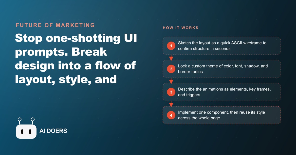
There is now a recognizable AI footprint spreading across the commercial web, and anyone who spends time on business websites can feel it without being able to name it. I am Madhuranjan Kumar, and the cause is a specific habit: business owners opening an AI coding tool and describing their website in one long prompt, then accepting whatever the tool generates. The output is functional. The structure is roughly correct. But it carries a texture that communicates generated rather than built. Stop sending one-shot UI prompts. The fix is a structured design flow with four sequential stages, and the difference between running it and skipping it is the difference between a site that looks like your business and a site that looks like every other AI-assisted build from the same month.
The one-shot UI prompt is producing a recognizable AI footprint across the commercial web
Ask a capable AI coding tool to build a landing page or a web application in a single prompt and you will receive something that is instantly recognizable as machine-made. Not because it looks bad exactly, but because the specific decisions it makes are the decisions the tool's training distribution pushed it toward: centered body text when left-aligned would read better, call-to-action buttons buried below the fold or missing entirely, spacing that does not breathe the way a designer's eye makes it breathe, and a color palette that is technically coherent but emotionally inert. These are not random errors. They are systematic outputs of asking one tool to solve structure, style, motion, and implementation simultaneously in a single pass.
The businesses that get this wrong share a common pattern: they invest the most time and attention in writing a better, more detailed single prompt, hoping the next attempt will be different. That investment is misplaced. The problem is not that the prompt was too short or lacked detail. The problem is a missing process. A more detailed single prompt gives the tool more information about what to generate, but it does not change the fundamental issue, which is that layout decisions, style decisions, animation decisions, and implementation decisions each require different kinds of judgment that cannot be resolved simultaneously without each one compromising the others.
The footprint accumulates because most builders do not diagnose this correctly. They add more detail to the next prompt. They switch to a different tool. They accept the output because fixing it piecemeal after generation is slower and more frustrating than starting over. The result is a commercial web where AI-built interfaces look increasingly similar, because they were all produced by the same one-shot process guided by similar training distributions.
Andrej Karpathy's flow engineering idea has found its most practical and immediate application
Flow engineering is an idea Andrej Karpathy named over a year ago, describing an approach where instead of searching for the perfect single prompt, you distill expert knowledge into a series of structured steps, each producing output you evaluate and refine before moving to the next. The idea was framed around AI systems in general. Its most immediately practical and commercially useful application right now is UI design.
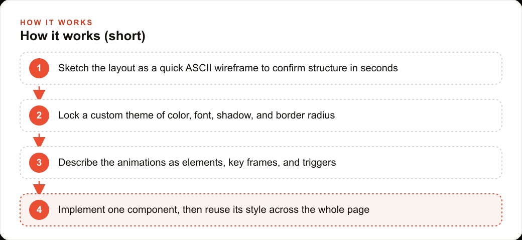
A senior designer does not sit down and produce a finished interface in one pass. They work through structure first, confirming that every necessary element is present and positioned correctly before spending time on visual details. Then they move to visual style, resolving color, typography, and spacing as a coherent system before any individual component is built. Then motion, adding animation as a layer on top of a stable visual foundation. Then implementation, building each component from the resolved design rather than making design decisions during the build. That sequence is not how designers were taught to work. It is what experienced designers discovered produces the best outcome most efficiently.
Flow engineering applied to AI-assisted UI design means encoding that expert sequence into the prompting process itself. You do not ask the AI to design and build simultaneously. You ask it to make one kind of decision at a time: structure in stage one, style in stage two, motion in stage three, implementation in stage four. Each stage uses the outputs of the previous stage as its input. Each stage produces options you evaluate and confirm before moving forward. The result is an interface that carries the marks of expert design process rather than the marks of a one-shot generation.
An ASCII wireframe turns a thirty-second layout check into a resolved specification
The most counterintuitive technique in the flow approach is also the most efficient: before writing a single line of HTML, React, or CSS, ask the AI to sketch the screen using ASCII characters. An ASCII wireframe generates in roughly one second. That means you can review the entire structure of a page, identify what is missing or misplaced, and iterate back and forth multiple times in under two minutes, total.
The structural problems the wireframe catches are the most expensive problems to fix after the fact. A reservation button buried below the fold on mobile. A section missing from the navigation. The primary call-to-action appearing after three paragraphs of supporting content when it should appear in the hero. A testimonial block placed above the product description rather than after it. Any one of those issues takes seconds to identify in ASCII and minutes to correct. In generated HTML, identifying the same issue takes longer because you have to navigate the structure visually, and correcting it requires finding the right element in a generated file you did not write.
The ASCII technique also works for interaction design. A sidebar that pushes the main content area when a hamburger menu is tapped. A modal that appears over dimmed content with a close button in the top corner. A sticky header that compresses as the user scrolls down. All of these can be described and confirmed in ASCII before any implementation decision is made.
One genuine limitation is that ASCII cannot convey relative visual weight or font size hierarchy. Every ASCII character is the same height, so you cannot see whether a headline reads as larger than the body text or whether a subheading is visually distinct. Font hierarchy needs to be described in words during the layout stage and confirmed through conversation rather than through the sketch. Everything else about structure, element placement, and interaction flow can be resolved in ASCII before a line of buildable code is written.
The style stage is where generic becomes brand, and it is where most builders rush through
Color, font choice, shadow depth, and border radius are the four controls that turn a default AI-generated look into something that feels like a specific business. Getting them right deserves deliberate time and explicit attention, because this stage is what separates an interface that looks generated from one that looks intentional. The style stage is also the stage that most builders rush through to reach implementation, which is exactly why so many AI-built interfaces carry the same generic texture.
The most effective starting point is a reference interface you genuinely like. Find something from a design showcase, a real product you admire, or a business in a different industry whose visual feel matches the brand you are building. Ask the AI coding tool to extract and output the approximate CSS from a screenshot of that reference. That process typically gets you to about 80 percent of the reference look. The remaining 20 percent requires human judgment: adjusting specific color values until they feel exactly right for the brand, trying different font pairings until the combination feels appropriate for the tone, and tuning shadow depth and corner radius until the details add up to something specific rather than generic.
A dedicated theming tool helps with this adjustment process, letting you modify values and preview the result before committing. Export the final stylesheet and bring it into the build as the locked theme. Once the theme is locked, everything built from that point forward inherits it automatically, which means the style decisions you made in this stage enforce themselves across the whole interface without requiring manual checking of every component.
The discipline this stage requires is to stay in it until the result genuinely feels like the brand, not until it looks acceptable. Acceptable is the enemy of branded. The difference between those two outcomes is where the interface starts to communicate something specific about the business rather than nothing at all.
A restaurant site rebuilt through all four stages, and what changed at each one
For a restaurant website, here is how I would run all four stages in sequence with concrete decisions at each one, and what the restaurant's owner would have felt if they had built the same site with a single prompt instead.
Stage one is the ASCII wireframe. I would ask the AI to sketch the homepage with these sections: a hero with the restaurant name, a short tagline, and a reserve-a-table button positioned prominently; a featured dishes section with three or four highlighted items; a photo gallery with six images in a grid; an hours, location, and map section; and a footer with contact details and social links. Reviewing that structure in ASCII takes 30 seconds. In this case, the first wireframe revealed the reservation button placed below the gallery rather than in the hero, meaning it was below the fold on mobile before a visitor had seen any food photography. The correction: move the button to the hero section, directly below the tagline. That one change, made in ASCII before any HTML was written, is the change most likely to affect how many visitors actually make a reservation after landing on the page. A single-prompt build would not have caught this, because the generated HTML would have looked plausible on a desktop browser while hiding the problem on mobile.
Stage two is the style lock. This restaurant is a warm neighborhood bistro: unpretentious, ingredient-focused, the kind of place that serves the same regulars on weekday lunch and new visitors on Saturday night. The style reference I would use is something with earthy warm tones, a serif typeface that reads as handcrafted rather than corporate, soft shadows that suggest depth without drama, and enough white space that the food photography breathes. I would extract the CSS from a reference, adjust the specific hex values to match the restaurant's actual brand colors, and try two or three font pairings until one felt right for the tone. That stylesheet becomes the locked theme. A single-prompt build would have received a default color scheme and a sans-serif system font, which communicates nothing about the specific character of this restaurant.
Stage three is animation, described in three sentences. The hero text fades in as the page loads, over about 400 milliseconds. Gallery images zoom slightly when hovered, pulling the viewer's attention to the image they are considering. Navigation links highlight smoothly as the corresponding section scrolls into view, giving the visitor a continuous sense of where they are on the page. Those three sentences are enough context for the AI to produce polished micro-interactions without over-engineering the motion.
Stage four is implementation, starting with one component. I would build the featured dish card first: the food photo, the dish name in the locked serif font, the price, and a two-line description, all styled precisely to the locked theme. Once that single card looks exactly right, I would ask the AI to build the hero, the gallery, and the hours section using the same style. Everything built after the reference card references what was already established, so the whole page stays consistent without needing manual review of every component.
The restaurant owner who ran all four stages has a site that communicates a specific, inviting character and puts the reservation action where mobile visitors will actually find it. The owner who sent one prompt has a site that is functional and forgettable. The two sites cost the same to build. The four-stage site took about two more hours of intentional process. That process is the entire difference between a site that builds trust on first contact and one that does not.
That is exactly what we do at AI DOERS. Book a private 30-minute call with Madhuranjan Kumar and we will map the fastest path to it for your specific business.
Book your call →
Madhuranjan Kumar
Madhuranjan Kumar brings 20 years of performance-marketing experience and has managed over $200 million in Facebook ad spend for brands across the United States and beyond. His expertise spans the full modern marketing stack: Meta, Google Ads, TikTok, email automation, CRM, and the websites that hold it together. At AI DOERS he turns that track record into lead-generation systems for businesses across every industry.