
How to Make a No-Code App Look Like Apple Designed It
You add Apple's native iOS components one at a time inside a native app builder, using prompts that name the exact package and link its docs, so an agent can implement headers, menus, tabs, sheets, pickers, switches, and haptics correctly.

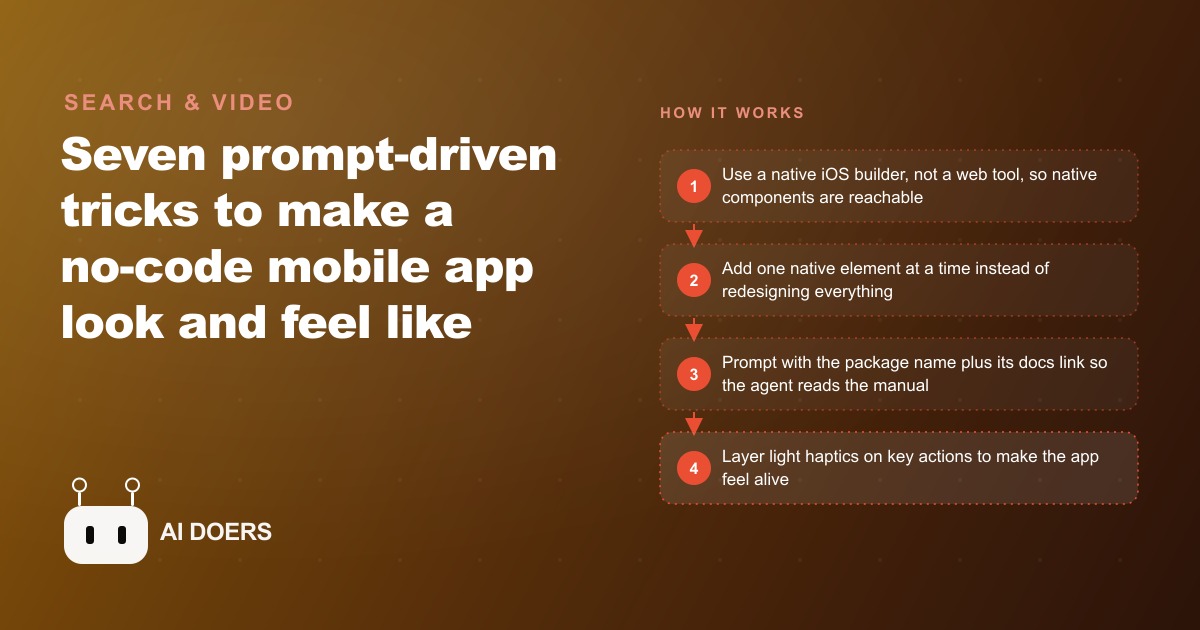
Most business apps look like what they are: websites crammed into a phone-sized rectangle. The padding is slightly wrong. The fonts ignore the system settings. The navigation does not follow the conventions iPhone users have internalized through ten years of using Apple's own applications. The scroll behavior is borrowed from a browser rather than a native view. The app works. It does not feel like it belongs on the device.
I am Madhuranjan Kumar, and the gap between a working app and one users describe as feeling Apple-designed is not features. It is not budget. It is not months of additional development time. The gap is the fifteen minutes per native element that most builders never spend. Seven specific elements, each accessible inside a native iOS builder with one explicit prompt, are the difference between an app that users rate as functional and one they rate as premium without being able to articulate exactly why.
Most No-Code Apps Look Like What They Are: Wrapped Websites
The distinction between a web-based builder and a native iOS builder is not technical vocabulary. It determines what you can physically reach. A web-based builder puts a browser rendering engine inside a native app shell. The result looks like a website because it is one. The iOS component library, the system-level UI elements Apple ships with every iPhone and uses in its own applications, is physically unreachable from inside a web view. CSS approximations of Apple's visual language exist, but approximation and native are not the same thing to someone who uses an iPhone every day and has calibrated expectations to match.
A native iOS builder compiles to real native code. When you add a component in a native builder, you are adding the same kind of component iOS itself uses. The platform provides the animations, the physics-based spring behavior, the haptic feedback responses, the accessibility properties, and the rendering characteristics. You do not write those behaviors. You invoke them. The result is not an imitation of how iOS looks and feels. It is iOS.
This distinction has been available in no-code form for several years, but most builders who want a mobile app reach for whatever shows up first in a search, which in most cases is a web-based tool. The result is an app that technically works and feels subtly wrong in ways users respond to clearly even when they cannot name the specific problem: shorter sessions, lower return rates, and ratings that describe the app as "fine" or "does the job" rather than good.
Confirming which kind of builder you are using is the first and most load-bearing decision in this approach. Every technique below requires native access. If you are in a web-based tool, none of these elements are reachable regardless of how precisely you write the prompt.
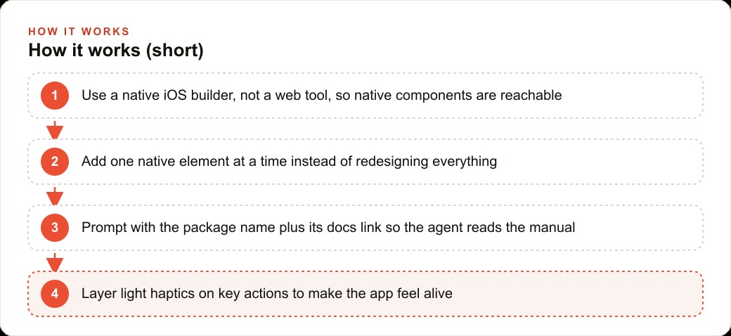
Seven Native Elements, Applied One at a Time With One Explicit Prompt Each
The large header scroll transition is the first and most visibly recognizable iOS behavior. A screen opens with a large bold title that collapses smoothly into the navigation bar as you scroll down, with the bar developing a subtle blur behind the content. Mail, Contacts, and the App Store all use this behavior. Adding it requires selecting the header element in the builder first, then prompting for the navigation large title behavior with a scroll collapse effect. Vague requests like "make the header look like Apple" do not produce it. Naming the behavior explicitly does.
Long-press context menus are the second element. A context menu appears when a user presses and holds on any element, revealing a set of options in a native-styled popup with proper icon alignment, visual hierarchy, and haptic feedback. This replaces custom dropdown overlays or action sheets that look designed rather than native, which is precisely what users can feel even when they cannot describe what is wrong with the custom version. The prompt for this element names the context menu package and includes a link to its documentation. The documentation link is not optional here, and the reason is specific: new native components often have thin training data in AI models. A vague prompt generates something that looks plausible based on inference from adjacent documentation. A prompt that names the package and includes the documentation URL directs the model to read the actual implementation guide and generate from what it says rather than from what it infers. The implementation becomes correct not because the model already knew it but because it read it.
The native bottom tab bar is the third element. The row of icons along the bottom of the screen that navigates between the app's main sections is the most familiar navigation pattern on iOS. A native tab bar matches exactly what the App Store, Music, and Maps use: system font for labels, correct icon sizing, correct selection animation, correct badge behavior. The prompt names the navigation bottom tabs package and includes its documentation link, for the same reason as the context menus. Implementation details for recent native components require reading the documentation rather than generating from training signal alone.
Bottom sheets with snap points are the fourth element. A bottom sheet is a panel that slides up from the bottom of the screen, like the detail view that appears in Maps when you tap a location. Snap points are the positions the sheet settles at: a small peek above the bottom edge, a half-height position for normal interaction, and full screen for content that needs room. The spring physics of the animation, the way the sheet resists a drag and snaps back to the nearest position, is what makes it feel native rather than custom-built. The prompt names the bottom sheet package with snap points and includes its documentation.
Native rolling date and time pickers are the fifth element. The spinning drum picker for selecting dates and times is one of the most recognizable iOS interface elements and reads as unmistakably native. The implementation detail that catches almost everyone attempting this for the first time: on a light background, the text color in the picker defaults to something close to invisible. The prompt must explicitly specify black text when the background is light or the picker appears but cannot be read. Without that instruction, the element renders correctly in every technical sense and is effectively unusable.
Liquid glass switches are the sixth element. The toggle used for settings and preferences, the pill-shaped button with a white circle that moves left to right, now renders with a glass-like finish that refracts and blurs the content behind it. Adding it requires one short prompt naming the liquid glass switch component. The visual effect is immediate and reads as distinctly current and premium.
Haptic feedback is the seventh element. Haptics are the subtle vibrations a phone produces in response to specific user actions: a light tap when a toggle switches, a slightly heavier click when content locks into place, a double pulse when something significant completes. Users who have been using iPhones for years are calibrated to expect this feedback from actions that feel important. An app that provides it feels alive in the hands. One that does not feels slightly hollow even when users cannot identify the specific reason. Most native builders have haptics built in and activate them on key actions without requiring an additional prompt. Enable them on actions that represent meaningful confirmations: saving something, completing a form submission, finalizing a purchase.
A bonus pattern worth noting: the same context menu component triggered by a long press can also be triggered by a visible button tap, making it a standard dropdown menu. Users who never discover that long pressing is an option still reach the same actions through a control they can see. One prompt, two entry points, the same native implementation.
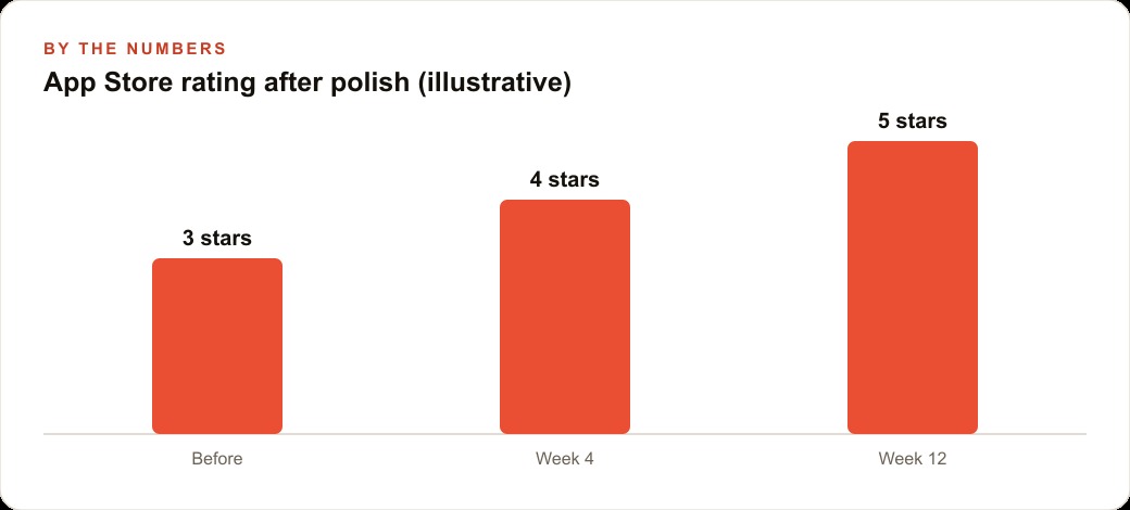
The AI Training Data Gap Is Why the Prompts Have to Be This Specific
The pattern shared across several of these elements, name the package and link the documentation, exists because of a specific characteristic of how AI models are trained. Models are trained on data from the web, and web data skews heavily toward things written about extensively over long periods. Established libraries with years of documentation, community tutorials, and answered questions have dense training representation. Components released in the past year, or behaviors added in recent iOS versions, have thin or no training representation.
When you ask a model with thin training signal for a native component using a general description, it fills the gap by generating something that looks plausible based on patterns from related documentation. The result may compile. It may even run. But it often produces the wrong component or the right component configured incorrectly in ways subtle enough to miss until you test on a real device. Prompting with a documentation URL bypasses this entirely. The model reads the documentation and implements from what it says rather than from what it infers. Correct implementation becomes a function of the quality of the documentation rather than the density of the model's training data for that specific component.
This principle generalizes beyond iOS native components to any rapidly evolving technical area. When you are working with recently released frameworks, newly supported APIs, or features added after the model's training data was collected, the documentation link is not a convenience. It is the mechanism that makes reliable implementation possible. For native iOS specifically, where each major iOS release introduces new patterns and refines existing ones, the combination of a specific package name and a current documentation URL is the standard prompt form that produces correct and current code.
The Fifteen-Minute Investment per Element That Most Builders Skip
The gap between an app that works and one that feels premium is consistent across mobile application projects: the builders who skip native elements almost always do so not because the elements are difficult but because they are not blocking anything. The app functions without them. Users can navigate, complete tasks, and access features. Everything the app needs to do technically, it does.
What the native elements do is different from adding functionality. They change the user's relationship to the app at a level below conscious evaluation. The large header that collapses on scroll signals that the person who built this understands how iOS works. The context menu on long press signals familiarity with platform conventions that builds trust before any cognitive evaluation of the app's content takes place. The haptic feedback on a confirmation tap is the sensory signal that the action was received and complete, the equivalent of the click a physical button gives but that a touchscreen cannot provide without deliberately triggering the haptic hardware.
Users who encounter these elements in an app built by a small business or an independent developer often describe the experience as surprising in a positive way. They came with modest expectations about what a business's own app would feel like and found something that felt considered and complete. That gap between expected quality and delivered quality is where loyalty forms and where word-of-mouth recommendations originate. An app that surprises users with its feel gets recommended in ways that an app that merely functions does not.
Apply them one at a time. Test each on a real device or a simulator before moving to the next. Do not attempt all seven in a single session, because managing seven simultaneous changes makes it difficult to isolate which prompt produced which result when something does not work as expected. One element confirmed and working is worth more than seven elements added simultaneously with none of them verified. The sequence you add them in matters less than the discipline of confirming each one before proceeding to the next.
Two additional small errors to avoid: forgetting to specify text color on the date and time picker, which makes it render and appear but be invisible on a light background, and applying haptics to every interaction rather than only meaningful confirmations. Subtle haptics on important actions feel deliberate and satisfying. Heavy or excessive haptics on every tap feel intrusive and reduce the experience rather than elevating it.
Seven elements, one at a time, fifteen minutes each, two hours total. The result is an app users and reviewers describe as polished and premium without being able to name the specific reason. The specific reason is that it feels like iOS rather than like a website on a phone, and fifteen minutes per element is all it takes to cross that line.
That is exactly what we do at AI DOERS. Book a private 30-minute call with Madhuranjan Kumar and we will map the fastest path to it for your specific business.
Book your call →
Madhuranjan Kumar
Madhuranjan Kumar brings 20 years of performance-marketing experience and has managed over $200 million in Facebook ad spend for brands across the United States and beyond. His expertise spans the full modern marketing stack: Meta, Google Ads, TikTok, email automation, CRM, and the websites that hold it together. At AI DOERS he turns that track record into lead-generation systems for businesses across every industry.