
How to Get Claude Code to Replicate a Design at Near 100 Percent
Feeding an AI agent screenshots alone gets you about 60 percent fidelity. The fix is to copy the real CSS, co-create one reference page, then extract a written style guide that drives every new design. Here is the workflow and how a real business can use it.

A workflow has been making the rounds that finally gets an AI coding agent to replicate a design at near perfect fidelity instead of the frustrating sixty percent everyone had learned to expect. The change is not a new model or a new plugin. It is a sequence, a specific order of steps that feeds the agent the right context at the right moment, and it turns pixel accurate design from a lucky accident into a repeatable process. I am Madhuranjan Kumar, and I think this is one of those quiet developments that matters more for ordinary businesses than the flashier AI headlines it is competing with, because it attacks a problem every brand actually has: keeping everything looking like it came from the same company.
The workflow that just closed the fidelity gap
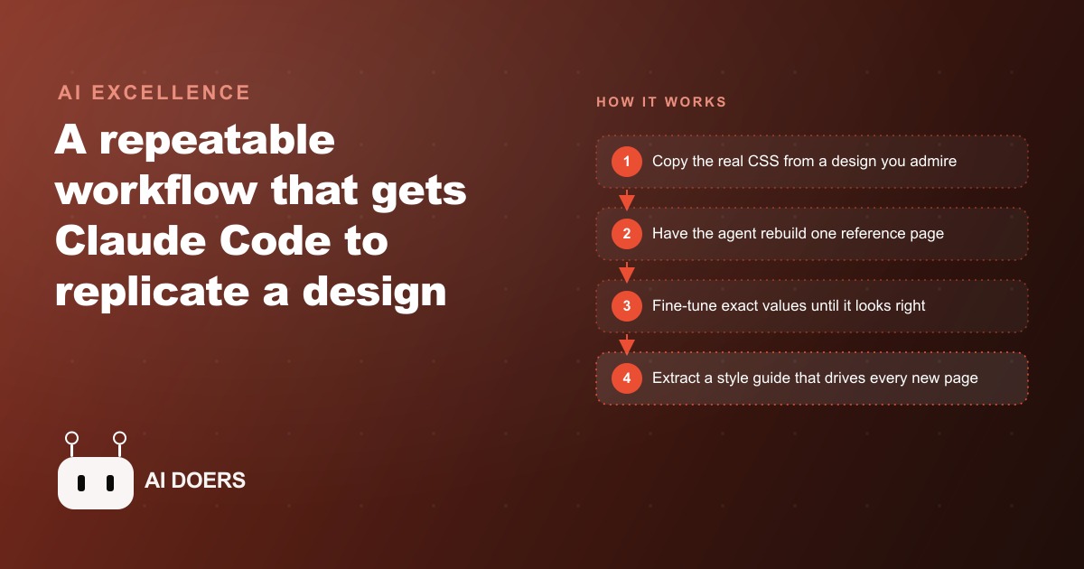
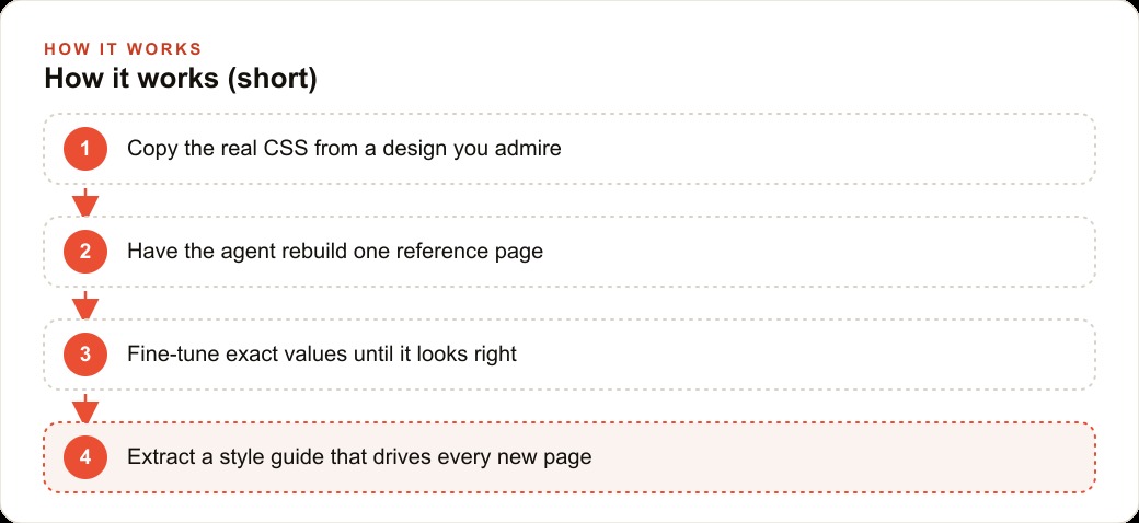
Here is what actually shipped as a practice, stripped to its bones. Instead of pasting a screenshot of a design you admire and asking the agent to build something similar, you give it the real code behind that design. On the site whose look you want, you right click, inspect, select the HTML, and copy the actual styles. Then you ask the agent to rebuild that page as a single HTML file using those extracted styles as its reference. That one page does two jobs at once. It captures the essence of the style with far more accuracy than any image could, and it becomes a working playground you refine until it is right.
From there the sequence continues. You fine tune the reference page using a free tool that lets you click any element and read its exact values, so when the agent guesses a color or a spacing wrong, you paste back the precise number and it corrects. Once the page genuinely looks right, you ask the agent to write a detailed style guide, a single document covering the overall feel, the color palette, the typography, the spacing system, the component styles, the shadows, the animation, and the border radius. That document becomes your on brand source of truth, and every new interface you generate points at it and inherits the same details. That is the whole method, and its power is in the order.
Why screenshots were quietly capping you at sixty percent
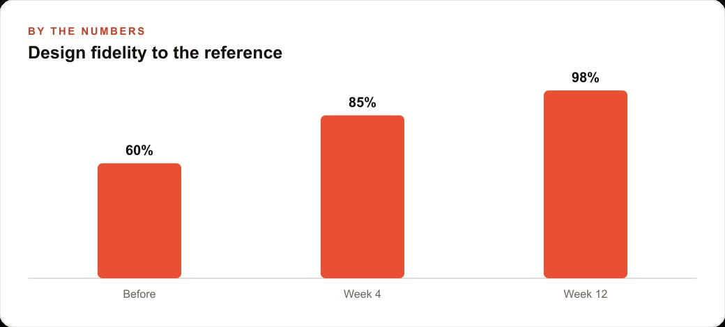
To understand why this is news rather than a footnote, you have to understand why the old way failed so consistently. When people teach an agent a look by handing it a screenshot, the result reliably lands around sixty to seventy percent of the way there. It looks vaguely right and is subtly wrong everywhere. The reason is simple and easy to miss. Language models are not good at reading every fine detail out of an image. They see a picture and infer approximate colors, approximate spacing, and approximate fonts, and approximate is exactly what you get back.
The fix is to stop giving the agent a picture of the design and start giving it the design. Real CSS is not an approximation of the styling. It is the styling, the literal values the browser uses to paint the page. Hand the agent those values and the guesswork disappears, which is why fidelity jumps. There is a second, subtler mechanism at work too, and it is the one most people overlook. Whatever the agent builds first becomes the standard it copies for everything afterward. A strong first reference page quietly lifts the quality of every page built later, and a weak first page drags all of them down. This is why the method spends so much effort perfecting a single page before scaling. That page is not just a deliverable, it is the seed the whole system grows from, and the discipline of getting it genuinely right is the difference between a design system and a slow accumulation of drift.
The real shift is a written style guide, not a better model
If you take one idea from this, take this one, because it is where the business value actually lives. The breakthrough is not that an agent can copy a page. It is that you can extract the brand into a written document an agent can follow forever. Most companies keep their brand in someone's head. The founder knows the blue is the right blue and the headings should feel a certain way, and everyone else guesses, which is why the flyer looks a little off from the landing page and the proposal looks a little off from both. That drift is expensive in a way that is hard to see on a balance sheet, because it makes a real company look amateur one slightly mismatched asset at a time.
A style guide that an agent can read turns brand consistency from a constant manual fight into a system. The palette, the fonts, the spacing, the component styles all live in one file, and any asset generated from that file comes out on brand automatically. And the guide is not limited to websites. The same document can drive slide decks, animated product demos built from your real interface components, and other design tools that generate whole sets of screens in your style. The work compounds because the style lives in a document rather than in a person, which means a non designer on your team can produce on brand work simply by pointing the agent at the guide. That last point is the quiet revolution here. You do not need a designer standing by for every small asset, because the design decisions were made once and written down.
Who this actually changes things for
This lands hardest for businesses that generate a constant stream of one off assets under deadline, because those are the businesses where brand drift is worst and most costly. Any company with a brand and a website qualifies, but the ones that feel it most are the ones producing listing pages, flyers, email campaigns, social posts, and presentations week after week, each made by a different person in a hurry. The whole point of the change is that consistency at scale stops requiring a dedicated designer gatekeeping every piece. It becomes a property of the system.
It matters just as much for how this connects to the rest of your marketing. A consistent, well built set of pages is not only prettier, it performs better, because the same clean structure that keeps your brand coherent also gives you fast, reliable landing pages for Facebook and Instagram ad campaigns and for Google Ads, where a page that loads clean and reads on brand converts more of the clicks you are paying for. And because the style guide produces well structured, consistent pages rather than one off tangles, that same foundation supports SEO and organic search instead of fighting it. The design system is not a cosmetic upgrade. It is infrastructure that everything downstream stands on.
There is a further reason this news lands harder for smaller operations than for big ones, and it runs against the usual assumption. Large companies have always had brand consistency because they could afford design teams and rigid brand books enforced by people whose whole job is to police them. Small businesses could not, so their materials drifted, and that drift was a visible tell that separated the small player from the established one. What just changed is that a written style guide an agent can follow gives a small business the same enforced consistency without the design team, which means the tell disappears. A two person agency can now produce materials as coherent as a firm ten times its size, because the consistency no longer comes from headcount, it comes from a document. That is the kind of leveling that does not make headlines and quietly reshapes who can compete, and it is exactly why I would rather a small business master this workflow than chase the flashier launches it is competing against for attention. The advantage compounds too, because once the guide exists it keeps producing consistent work for months without further investment, while a competitor still paying a freelancer per asset keeps paying and keeps drifting. A one time effort that pays consistency dividends indefinitely is the rarest kind of leverage a small business can get, and this workflow is one of the few honest examples of it.
A real estate agency that stops paying for one off design
Let me make this concrete with an unnamed real estate agency, because agencies are almost a perfect illustration of the problem this solves. An agency produces a relentless flow of assets: listing pages, printable property flyers, just listed social cards, email blasts, and buyer presentations. They almost always look inconsistent, because each one is made by a different person under a deadline, and there is no shared standard beyond a logo file and a vague sense of the brand color. The result is a firm whose materials look like they came from five different freelancers, which quietly undercuts the premium image the agency is trying to project.
Here is how I would set this up. I would start by taking the agency's best looking existing page, or a polished site the principal admires, and copying its real CSS so the agent can rebuild it as one clean reference page. Then I would fine tune the colors and spacing until it matched the agency's actual brand precisely, using the element inspection tool to lock in exact values rather than eyeballing them. Once that page is genuinely right, I would have the agent extract a style guide from it, capturing the palette, the fonts, the spacing, and the component styles into one document.
Now every asset flows from that single source. A new listing page, a printable property flyer, a just listed social card, and a buyer presentation deck can all be generated on brand from the same guide, so they finally look like they came from one firm. Put illustrative numbers on the shift. If fidelity to the agency's real brand was landing around sixty percent on a rushed screenshot copy, it can climb toward near perfect once the guide exists, and the more important number is the human one. A team member who is not a designer can now produce on brand work in minutes by pointing the agent at the guide, where before every asset either waited on a freelancer or shipped slightly wrong. The agency stops paying per asset for design and starts running a design system, and the recurring cost of that inconsistency, both the freelance invoices and the invisible tax of looking amateur, simply goes away.
The move to make this week
The concrete action is smaller than it sounds, and that is the point. Do not attempt a full rebrand. Pick the single design you most want your work to match, copy its real CSS, and have the agent recreate it as one HTML file. Put your effort into getting that first reference page genuinely right, nailing the exact values with the inspection tool, because everything downstream inherits from it and a sloppy first page poisons the whole system. Only once you love that page should you ask the agent to write the style guide, and then test the guide immediately by generating a fresh page from it and checking that the details actually hold.
The tools involved are free or low cost, and the workflow is learnable, so a hands on person on your team absolutely should try it. The discipline that matters is patience on the first page and clarity in the style guide, because a vague guide produces vague results in the same way a screenshot did. If you would rather have the reference page built, the style guide extracted, and the whole asset system stood up so your team can produce on brand listings, flyers, and decks without touching a designer, that is exactly the kind of system I help businesses build, and a short call is the fastest way to see how it would work for your agency.
That is exactly what we do at AI DOERS. Book a private 30-minute call with Madhuranjan Kumar and we will map the fastest path to it for your specific business.
Book your call →
Madhuranjan Kumar
Madhuranjan Kumar brings 20 years of performance-marketing experience and has managed over $200 million in Facebook ad spend for brands across the United States and beyond. His expertise spans the full modern marketing stack: Meta, Google Ads, TikTok, email automation, CRM, and the websites that hold it together. At AI DOERS he turns that track record into lead-generation systems for businesses across every industry.