
How to Build Your First Mobile App With AI Using Only Prompts
You can ship a real mobile app without writing a line of code by treating prompts like a spec. Open with a broad goal, define every vague term, lock the layout, and let the agent handle the code, the fixes, and even a remix into a brand new app.

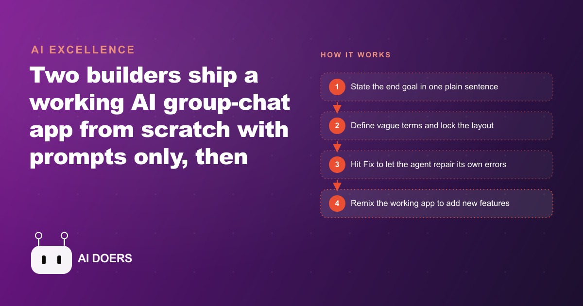
Anyone can ship a working mobile app today without touching a single line of code. The only skill required is the ability to write clear instructions, and that is something every business owner already does every time they brief a hire.
I am Madhuranjan Kumar, and I have been watching business owners waste months waiting for developers to build tools that take an AI agent an afternoon. The shift is not incremental. It is categorical. A real group-chat app with a database, real-time messaging, user profiles, an embedded AI assistant, and a remix into a GPS running tracker was built from scratch using only prompts. That is the benchmark we are working toward in this article. Below are the eight prompt-craft rules that made it happen, each one concrete enough to apply to your own app idea today.
1. Open with the broad goal line before touching any detail
Every strong prompt starts with one plain sentence that names the end goal. Nothing else. No feature list, no screen descriptions, no color preferences. Just the goal.
In this build the opening line was: make me a group chat app where everyone is a unique user. That sentence does three things at once. It tells the agent what category of product it is building. It tells the agent what the primary action is, which is chatting. And it introduces the first constraint, which is that users must be distinct from one another.
The temptation is to dump everything into the first prompt, every feature, every edge case, every preference. Resist it. A long first prompt produces a bloated first draft that misses the core experience and takes longer to repair than a focused starting point would have. The goal line anchors the agent to the single most important thing. Features come after the skeleton is standing.
This principle applies whether you are building a client intake form, a member-booking app, or a loyalty program. Write the goal first. Add detail in subsequent prompts.
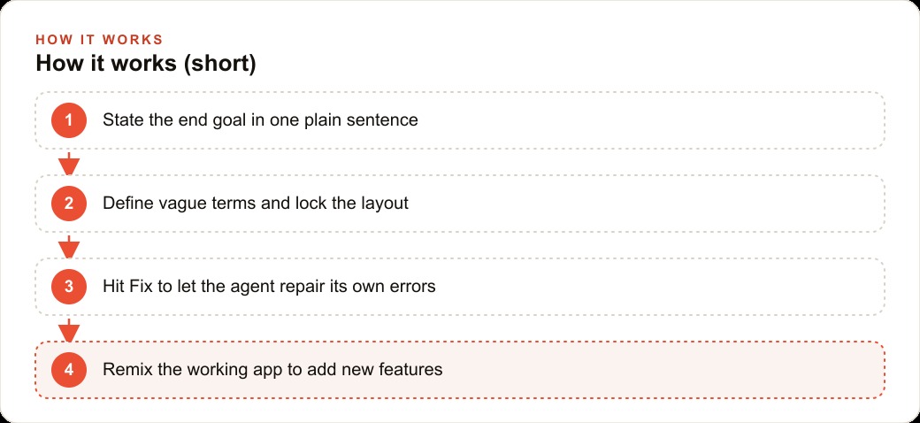
2. Define every vague term the moment you use it
Vague words are the most common source of results you did not want. The agent fills gaps on its own, and its assumptions rarely match yours. The fix is simple: define every term as soon as you introduce it.
In this build, unique user needed a definition. The definition given was: one persistent account per device. That one clause removed the need for a full authentication system. A share link would gate access, so anyone who opened the app would be a legitimate user. No email verification, no password reset flow, no account recovery path. The definition did real architectural work in a single sentence.
Every app idea has vague terms hiding inside it. A booking app has booking, which could mean a reservation, a payment, a confirmed slot, or all three. A loyalty app has member, which could mean someone who signed up, someone who spent above a threshold, or someone who paid a subscription. A delivery app has nearby, which could mean a one-mile radius, a ten-minute drive, or a specific zip code. Name the term, write the definition, and attach it to the prompt where the term first appears.
This habit alone cuts revision cycles in half.
3. Name the one feature that must work, no exceptions
Agents optimize across many signals at once. When you give them a full feature list, they balance trade-offs and occasionally sacrifice the most important thing in favor of something flashier or easier. A single line that flags the non-negotiable prevents this.
In this build the line was: make sure messaging works. That is all it said. No technical specs, no latency requirements, no delivery guarantee language. Just a clear declaration that the chat function is the load-bearing wall.
The agent heard it. Messaging worked on the first draft. Profile photos had a rendering quirk. The layout had a small spacing issue. But the feature that mattered most was solid from the start, which made every subsequent fix a cosmetic problem rather than a structural one.
Your version of this line will depend on your app. For a booking tool it might be: make sure a user can complete a booking without logging in. For a loyalty app it might be: make sure the points balance updates immediately after every purchase. For a delivery tracker it might be: make sure the driver location updates in real time. Pick your one thing and say it plainly.
4. Lock the layout before the agent draws anything
The agent has processed thousands of app interfaces. When you leave the layout open, it makes choices that are technically reasonable but often wrong for your context. Specifying the layout precisely before the agent starts removes that variable entirely.
In this build the layout description was exact. A header at the top with a profile icon on the right side, the chat room name editable in the center, and a settings icon on the left. A message thread filling the middle of the screen. A text input bar fixed at the bottom with visible placeholder text. Nothing was left to interpretation.
The result matched the description on the first draft. No back and forth about where the settings icon was, no renegotiating the header structure, no debate about what the empty state should look like. Specific layout descriptions translate into specific outputs.
This precision matters more on mobile than on desktop. A phone screen is narrow and the keyboard eats a third of the vertical space the moment someone starts typing. Layouts that look balanced in a desktop mockup can become cramped and confusing on a phone. Describe the layout with the phone in mind, and note any element that needs to remain visible when the keyboard is open.
5. Split the onboarding across two screens instead of one
First impressions in a mobile app are set in the onboarding flow. A screen that is too crowded, or that hides important fields below the keyboard line, creates friction before the user has seen any value.
In this build the onboarding collected a display name, a short bio, and a profile photo. That is three inputs. On a small phone screen with the keyboard open, three inputs on one page push at least one field off the visible area. The solution was a two-screen onboarding flow. Screen one took the name. Screen two took the photo. Clean, fast, and keyboard-aware.
The rule is practical: if your onboarding collects more than two inputs and any of them require the keyboard, split the flow. The cost is a second screen. The benefit is a first experience that feels considered rather than rushed.
This same logic applies to any multi-step form in a business app. A client intake form that asks for name, email, service type, budget range, and project description should not live on one screen. Spread it across steps. Each step feels small and manageable. The total information collected is the same, but the user experience is fundamentally different.
6. Use the Fix button instead of explaining the error
This rule changes the dynamic for every non-technical builder. When something breaks, the instinct is to read the error message, try to understand it, form a theory, and write a prompt describing your theory. That process takes time and produces hit-or-miss results because most business owners are not equipped to interpret stack traces.
The better path is one click. Hit Fix. The agent reads its own logs, traces the problem back through its own code, and patches it. In this build, a save-profile error appeared after the user tried to update their display name. The error message included technical validation language that meant nothing to the builder. One Fix click later, the agent had diagnosed the schema mismatch and corrected it without any human explanation.
The agent understands its own errors better than you do. It wrote the code. It knows what the error message means in the context of that code. Your job is to tell it to look, not to tell it what to look for.
The Fix pattern also pairs well with voice prompts for smaller cosmetic issues. Speaking a fix out loud, such as "make the message bubbles four pixels larger and add padding on both sides so the text does not touch the edge," is faster than typing it and allows you to look at the screen while describing what you want changed rather than switching back to a keyboard.
7. Embed a context-aware AI assistant, not a generic chatbot
An AI assistant inside a business app is only useful if it knows the context of that specific app. A generic chatbot that answers general questions adds little value. An assistant that pulls the last two hundred messages from the database, reads the group context, and answers questions about that specific conversation is genuinely useful.
In this build the assistant was built exactly that way. Anyone in the group chat could type at-AI and ask a question. The assistant would query the database for the recent message history and the group metadata, then answer using that content. Questions like "what did we agree about the deadline" or "who mentioned the contact name for the supplier" returned accurate answers because the assistant was reading the actual conversation, not hallucinating a plausible response.
This pattern is directly applicable to business tools. A gym app where the assistant knows the class schedule and waitlist status can answer member questions at any hour without front-desk involvement. A client management tool where the assistant has read every previous interaction can surface relevant history when a new request comes in. The AI assistant becomes useful the moment it is given the right context, and giving it the right context is a prompt-craft decision made at build time.
Business owners who want to go further with this kind of context-driven AI layer inside their operations can see how it connects to larger customer relationship strategy in our web and CRM consulting work.
8. Remix a working app instead of starting from scratch
The most underused capability in vibe-coding platforms is the remix. A working app in a public gallery can be cloned in a single click. From that clone, a new set of prompts reshapes it into something entirely different while keeping the parts that already work.
In this build the group-chat app was remixed into a live running tracker. The new prompt described the tracker in full: a map that broadcast the runner's live location into the group chat, a panel showing elapsed time, total distance, and current pace, and a start/stop control that updated every other member in real time. That is a substantial feature set. It was built in a single prompt session starting from the chat app's infrastructure rather than from a blank canvas.
The value compounds. Every working app you build becomes a starting point for the next one. A gym owner who builds a class-booking app in an afternoon can remix it into a member-challenge tracker the following week. A consultant who builds a client intake form can remix it into a vertical-specific diagnostic tool for a new industry. The library of starting points grows with each build, and each new build takes a fraction of the time the first one did.
This is where the real productivity advantage sits. Not in any single app, but in the accumulating library of reusable architecture that each build adds to.
What this looks like in practice: a fitness studio example
Picture an independent fitness studio with one location, about four hundred members, and a front-desk team that fields the same questions every morning. The owner wants a member app but has no budget for a development agency.
The owner starts with the goal line: build a member app where people can check in, see the class schedule, and message the front desk. Then the definitions: a member is one account per phone number, a class has a name, a start time, a duration, and a maximum capacity, and the front desk message thread is a separate tab from the class list.
The layout is locked before anything is built. A header with the studio logo on the left and the member's first name on the right. A class list sorted by start time in the center. A message tab fixed at the bottom of the screen with a badge showing unread counts. The onboarding splits across two screens: screen one takes the display name and membership tier, screen two takes a profile photo and an emergency contact.
The core function line is: make sure the class list loads within two seconds and the check-in button is visible without scrolling.
The AI assistant inside the member app connects to the class schedule database and can answer questions about availability, waitlist position, and instructor assignments. The front desk estimates that the assistant handles roughly thirty member questions per day that previously required a staff reply, at an average of ninety seconds per question. That is forty-five minutes of front-desk time recovered every day, roughly fifteen hours per month.
At a front-desk hourly rate of twenty dollars, that is three hundred dollars in recovered labor each month from the assistant alone, before accounting for any improvement in member satisfaction or booking conversion. The platform subscription that makes this possible costs fifty dollars a month. The math is not complicated.
After the base app is live, the owner remixes it into a member challenge tracker. Members log workouts inside the app, the AI assistant tracks streak counts from the workout history, and a leaderboard updates in real time. Building that from the existing app takes one afternoon. Building it from scratch would have taken a separate project timeline.
Owners who use tools like this inside their growth strategy consistently find that the client relationships generated by the app itself become easier to manage and retain. That retention dimension connects naturally to paid acquisition, which we cover in the context of Meta ad strategies and Google ad campaigns for service businesses.
The same approach that made the fitness studio app possible applies to any business with a repeating customer relationship and a staff team fielding the same questions over and over. The prompt-craft skills do not change. Only the goal line and the layout description do.
If you want to talk through how this kind of tooling fits into a broader digital growth plan for your business, a thirty-minute strategy call is the fastest way to map it out. The link to book one is at the top of this page.
That is exactly what we do at AI DOERS. Book a private 30-minute call with Madhuranjan Kumar and we will map the fastest path to it for your specific business.
Book your call →
Madhuranjan Kumar
Madhuranjan Kumar brings 20 years of performance-marketing experience and has managed over $200 million in Facebook ad spend for brands across the United States and beyond. His expertise spans the full modern marketing stack: Meta, Google Ads, TikTok, email automation, CRM, and the websites that hold it together. At AI DOERS he turns that track record into lead-generation systems for businesses across every industry.