
How to Build $5,000 Client Websites in Minutes with Gemini 3
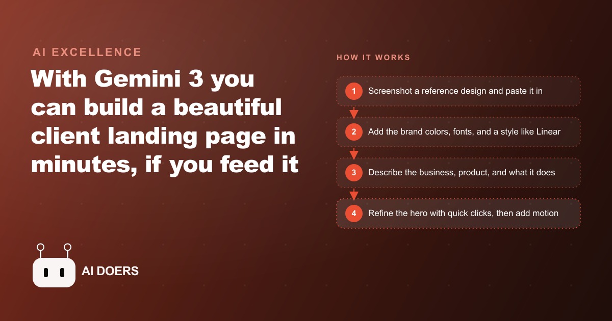
Gemini 3 will build a beautiful, client-ready landing page in minutes once you feed it the right inputs: a screenshot reference, the exact brand colors, a known style reference, and a clear description of the business.

Most AI-built websites look exactly like what they are: a prompt with a business name dropped into a generic template that the model had seen ten thousand times before.
I am Madhuranjan Kumar, and after watching hundreds of AI website attempts over the past year, the problem is almost never the model. Gemini 3 can produce genuinely beautiful, client-ready output. The gap between a forgettable AI site and one a client happily pays for is not the tool. It is the inputs you give the tool and the sequence you follow. Here are seven things that make the difference consistently.
1. A real screenshot reference, not a description in words
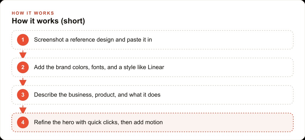
The single highest-leverage move in an AI website build is the first one: take a screenshot of a design you actually want to match and paste it in before you write a single instruction.
On a Mac, Command-Shift-4 captures a region of the screen in seconds. On Windows, the Snipping Tool does the same. Paste that image directly into Gemini 3 and tell it this is the quality level and the visual style you are working toward. You are not asking it to copy the site. You are giving it a concrete quality target. Without the image, the model has to guess what "clean" or "modern" or "premium" means to you, and its guess is usually a safe, forgettable average of everything it has seen labeled with those words. With the image, it has a specific answer.
This one change, screenshots over descriptions, is responsible for more of the quality gap between good and bad AI sites than any other single decision. Every other item on this list assumes you have done this first. If you skip it, the rest of the inputs carry a much heavier burden.
The second function of the screenshot is that it grounds the client conversation before anything is built. When you show a client the reference image and they approve it, you have de-risked the whole build. They have already said yes to the quality level. The AI output is then a question of execution against an agreed standard, not a question of whether you guessed their taste correctly.
Screenshots also serve as the most efficient mood board you can build. Three screenshots from three different sites, pasted together into a single image before you paste them into Gemini, communicate a visual direction faster and more precisely than any written brief. The model synthesizes across all three and produces something that draws from each, which gives you originality built on top of concrete quality references rather than originality that starts from zero and risks landing somewhere generic.
2. Brand colors borrowed from a site you already respect
Do not ask Gemini to make up a color scheme. Do not tell it to use a palette of blues and grays and see what it produces. Tell it to work in the style of a specific site that is already known for its visual quality, and name that site explicitly.
Saying "in the style of apple.com" pulls a clean, white, high-contrast aesthetic into the output. Saying "in the style of squarespace.com" pulls a sophisticated, editorial look. Saying "in the style of stripe.com" pulls a precise, developer-grade technical feel. Gemini has trained on these sites extensively and can match their tonal register with a single reference. The instruction costs you four words and replaces several prompts worth of color and spacing guidance.
For client work, you take this one step further. You ask the client for one site they genuinely admire, even if it is in a completely different industry, and you use that as the style reference alongside their actual brand colors. The combination of a style reference for the overall aesthetic and the client's real brand hex codes for the actual palette gives Gemini two concrete anchors instead of one vague direction. The output is noticeably more on-brand and more distinctive than anything produced from a free-form description.
If the client's industry is relevant, running this approach alongside a seo-content and positioning strategy review before the build helps ensure the visual style matches the audience's expectations for the category, since a med spa and a SaaS tool and a plumbing company all have different visual registers that convert differently for their respective audiences.
3. Half your time on the hero before touching anything below the fold
The hero is the only section that everyone sees. Every visitor who lands on the page sees the hero. Fewer than half of them scroll far enough to see the features section. A smaller fraction still reach the pricing block or the FAQ.
This is not an argument for neglecting the sections below the fold. It is an argument for investing time in proportion to the audience that each section actually reaches. The hero headline, the hero subhead, the hero image or visual, and the hero call-to-action button are collectively worth more of your prompting effort than the rest of the page combined, because they are doing more conversion work than the rest of the page combined.
The specific habit this produces: build the hero, evaluate it honestly, and only move down the page once the hero is genuinely strong. This sounds obvious but is violated constantly in practice, because working below the fold feels like progress even when the top of the page is still weak. A client looking at a demo scrolls from the top. If the hero does not capture them, the quality of the pricing section is irrelevant. The hero is also the section that becomes the preview image in link shares and social posts, which means it is doing marketing work that extends beyond the page itself.
4. A named style anchor before you describe any section
When you name a known product in your Gemini prompt, you are not just giving it a visual reference. You are accessing a dense cluster of design decisions that the model has internalized from training on thousands of screenshots, teardowns, and design reviews of that product.
Say "Linear-style" and Gemini understands a whole aesthetic: dark backgrounds, tight typography, subtle gradients, minimal UI elements, and a technical confidence in the layout. Say "Notion-style" and it understands something different: clean white space, simple hierarchy, content-first structure. Say "Airbnb-style" and it understands photography-forward, trust-building warmth. Each of these references carries far more information than you could convey with a paragraph of description.
This matters for paid advertising landing pages and Google Ads destination pages especially, where the visual register of the page affects quality score and conversion rate simultaneously. A landing page that looks technically precise converts differently than one that looks warm and lifestyle-forward, and the style anchor you choose determines which direction the AI goes before you write the first section description.
Name the anchor in the first prompt. Do not add it after you have already generated a layout and are trying to steer the model away from what it produced. Front-loaded style references work. Corrective style references after the fact require the model to fight its initial momentum, which is slower and less reliable.
5. The section vocabulary before you start the build
Every good landing page is made of the same sections, and those sections have names that the model understands precisely. Knowing those names before you prompt changes how specifically you can direct Gemini, which changes the quality of what it produces.
The standard section vocabulary: hero (the top section with the primary headline and call to action), social proof (logos of known clients or press mentions), features (the capabilities or services in a grid or list), testimonials (customer quotes with attribution and a face or logo), pricing (tiers or a single price with what is included), FAQ (questions and answers organized by what a skeptical buyer would ask), and footer (navigation, legal links, contact information).
Layout terms layer on top: bento grid (irregular card sizes arranged together like puzzle pieces, popular in SaaS), split layout (image on one side, text on the other), and full-bleed (image or video extends to the edge of the screen with text overlaid). Knowing these terms means you can say "give me a bento features section" instead of "make the features section look more interesting," and the model has a concrete instruction to execute rather than a subjective one to interpret.
For agencies building sites for clients with local content and SEO needs, this vocabulary also helps you brief the client. When the client says they want the site to look "busy with information," you can ask whether they mean a bento grid on the features section or multiple testimonials visible at once, and the specific question produces a useful answer instead of an unactionable general preference.
6. A named animation rather than a vague "make it more dynamic"
Default AI-built sites have default buttons: plain black or white rectangles with a hover state that changes the background color. That is not wrong. It is simply unremarkable, and unremarkable does not convert clients who are evaluating you against agencies that have been doing this for years.
A single, specific animation prompt changes this completely. Gemini 3 can add a laser-beam glow to the primary button, a smooth fade-in entrance for each section as it scrolls into view, card-flip effects on the feature tiles, and a typewriter animation on the hero headline. Each of these is a one-prompt addition, not a rebuild. The instruction is specific: "add a glowing laser beam animation to the primary CTA button" or "make each feature card flip to reveal the detail on hover." Specific animations produce reliable results. Vague requests for "more dynamic" produce unpredictable ones.
The strategic reason to invest in one or two animations on the hero and the CTA is simple. Clients evaluate agency work visually in the first thirty seconds. An animated hero creates the impression of sophisticated execution that plain static layouts do not, regardless of how strong the copy is. The animation is not the product. It is the signal that the person who built this page cared about the details, and that signal affects whether the client trusts the agency enough to proceed.
7. Quick-click refinements instead of re-prompting the whole page
Every prompt you send to Gemini 3 costs money, typically around twenty cents per generation. Rebuilding a whole page from a revised prompt to change the font weight or shift a background color burns credits at a rate that adds up quickly across a client project.
The alternative is to use the refinement tools that Gemini exposes for visual properties: font families, font sizes, background colors, border radius, and spacing adjustments can often be tuned with a click or a slider without triggering a full re-generation. Reserve re-prompting for structural changes, sections that need to be added or reordered, or section content that needs to be substantially rewritten. For visual polish, exhaust the click-level refinements first.
There is also a practical discipline this enforces: it separates structure decisions from polish decisions. Structure decisions are expensive to change late in the build, so they should be made deliberately with client input. Polish decisions are cheap when you use the click tools and expensive when you re-prompt. Making this separation explicit helps you move through a build efficiently, locking the structure early and spending the remaining credits on content and polish in the right order.
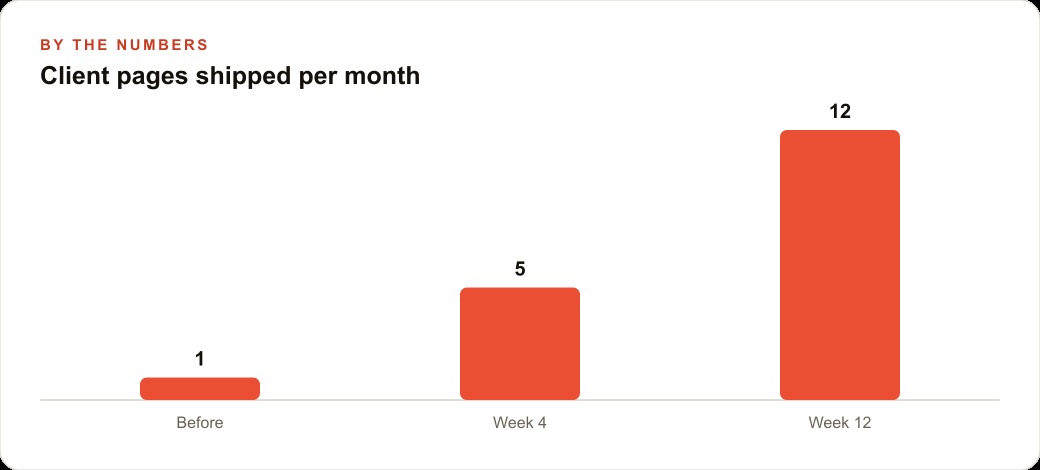
Running this approach, the agencies and freelancers who are building sites efficiently with Gemini 3 are shipping client-ready pages in a single working session. The references do the heavy lifting. The style anchor eliminates the most common wrong directions early. The hero gets the time investment it deserves. The animation earns the client's trust on the first look. And the click refinements preserve the credit budget for the decisions that actually require the model to think. Get those seven inputs right and the generic AI website problem disappears entirely, and the gap between what you produce and what a client pays a full-service agency for becomes a question of polish and iteration rather than a fundamental quality difference.
That is exactly what we do at AI DOERS. Book a private 30-minute call with Madhuranjan Kumar and we will map the fastest path to it for your specific business.
Book your call →
Madhuranjan Kumar
Madhuranjan Kumar brings 20 years of performance-marketing experience and has managed over $200 million in Facebook ad spend for brands across the United States and beyond. His expertise spans the full modern marketing stack: Meta, Google Ads, TikTok, email automation, CRM, and the websites that hold it together. At AI DOERS he turns that track record into lead-generation systems for businesses across every industry.