
GPT Image 2.0 Is the Biggest Image-Model Leap Yet, and It Points at Code
OpenAI's GPT Image 2.0 posts the largest gap over rivals on record, with text rendering and front-end coding strong enough that the next step is turning a generated design into a working website.

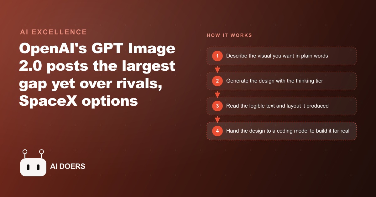
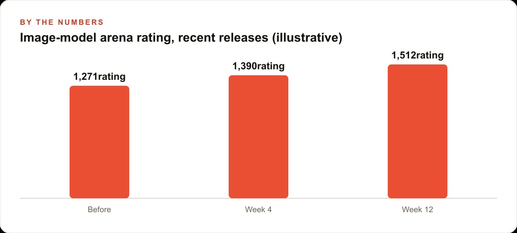
The 200-point lead over rivals in the arena scores will get cited all week, but the number that actually changes something for a business is zero, because that is how many words of garbled text appeared in the most demanding text-rendering tests.
Arena ratings and commercial usability are two different tests
Arena-style model evaluations measure preference. Human evaluators see two images, pick the one they prefer, and their choices aggregate into a rating. That format is useful for understanding which model produces outputs people find more appealing, but appealing and usable are not the same thing, and for business applications the distinction matters enormously.
Most commercial image work requires text that reads correctly. A promotional flyer with garbled pricing is worthless no matter how beautifully composed the background is. A restaurant menu where dish names bleed into nonsense letters cannot be printed or handed to a customer. A real estate card with a phone number that warps into abstract shapes will not generate a call. An ad with a tagline that looks like text from a distance but cannot be read up close will not convert. For every one of these use cases, the relevant quality test is not whether human evaluators prefer the output on an aesthetic dimension. The relevant test is whether every word is readable, every number is correct, and every piece of text is positioned where it belongs. That is a pass-fail binary, not a preference ranking.
The arena rating measures one thing. Text-rendering accuracy measures another. Before this release, the text-rendering test was failing at a rate that made AI image tools professionally unusable for any work requiring words on the visual. The rating climbed gradually across the category. The usability crossed a threshold. Those are different events, and the threshold crossing matters far more for businesses doing real marketing work than a 200-point gap in a preference ranking ever could.
Madhuranjan Kumar's view on this is direct: the headline number most people will share this week is the wrong metric to focus on for anyone deciding whether to change their workflow. The question is not whether the model is 200 points ahead of rivals on a preference ranking. The question is whether it passes the text test on the asset types the business actually needs to produce. On that test, the answer from this release is yes in a way it has not been before, and that is the development worth acting on.
The text-rendering threshold that just crossed and what it actually means for business
Text rendering in AI image models has been a sustained embarrassment for the category since its inception. Every major model has shipped with the same weakness: ask for an image with words in it and receive something that looks plausible from a distance and falls apart the moment you try to read it. Nonsense letters that follow the visual rhythm of real text. Numbers that are individually plausible but placed in combinations that make no sense. Captions that blur into illegibility at the edges. Label text that drifts away from the thing it is labeling. For anyone who needed a professional marketing asset with words in it, which describes almost everyone doing real marketing work, this was not an aesthetic problem. It was a dealbreaker.
What crossed in this release is the threshold at which the model handles the hardest text-rendering challenges without producing garbled output. A detailed architectural blueprint with dimensions, floor-plan labels, and capacity notations came back legible and sensible on every label. A commemorative plaque rendered with clean, complete text and no nonsense characters. A full restaurant menu with dish names, section headers, descriptions, and prices returned a layout that could be printed and placed on a table without embarrassing the restaurant. These were the hard cases, and the model passed them.
The thinking tier is doing the heaviest work here. The instant tier answers fast and is fine for quick visual drafts, but the thinking tier adds a web search step and an extra reasoning pass before drawing, and in testing it produced substantially stronger text outputs across the hard categories. The practical rule is to use the thinking tier when accuracy matters: anything with text, precise layout, or factual content. The instant tier for quick visual reactions and iteration.
The implication is not that the model is perfect on text. There are still edge cases where complex nested labels or very small text produce errors, and a careful review before publishing anything with pricing, dates, or addresses remains essential. But the threshold that crossed is the one that decides whether the tool is professionally usable for marketing work, and it crossed. Businesses that dismissed AI image tools because of the text problem can now re-evaluate that dismissal. The barrier that kept them out is substantially lower than it was three months ago.
Why the SpaceX deal sends the same signal as the image release
The news about SpaceX taking an option to acquire a major code-editing platform and paying a significant figure just for the partnership, before any acquisition closes, signals something that the image release also signals, even though the two stories seem unrelated on the surface.
Both events are examples of capability concentrating rapidly and serious actors betting that the concentration will continue. The image model crossed a text-rendering threshold that no previous model had clearly passed. The infrastructure deal attaches massive compute resources to a coding tool that is already leading its category. Both moves reflect a judgment by sophisticated parties that the current pace of improvement is not slowing, that the gap between the current frontier and what comes next is likely to be as large as the gap between last year and now, and that the tools and businesses positioned at the frontier now will hold a compounding advantage as that gap continues to open.
For a business owner, the relevant takeaway from both stories is not which company bought what or what the valuation implies. It is that the capabilities being competed over are becoming commercially decisive, not just technically impressive. A code tool with massive compute behind it produces better code faster, which means a company using it builds software faster than one using a weaker alternative. An image model that passes the text-rendering test produces professional marketing assets that a company using an older model cannot match without a human designer in the loop. In both cases, the advantage accrues to the business that adopts the capability now rather than waiting.
The businesses watching these developments and still treating AI image tools as experiments are making a costly choice. The experiment phase is over for the capabilities that actually crossed thresholds. The question now is which workflows to run on which tools, not whether the tools are ready.
The design-to-code workflow that already exists and most businesses are not running
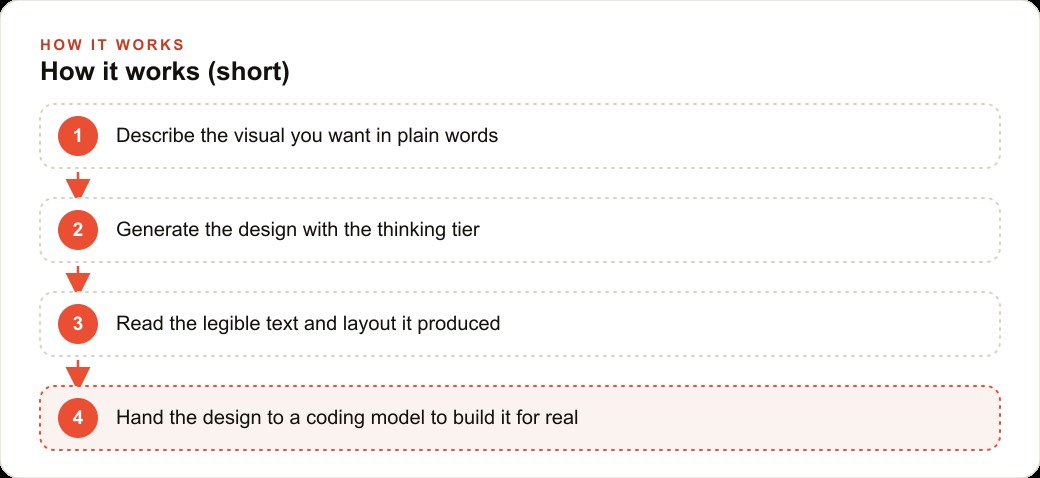
One of the capabilities this release makes more practical is a two-stage design-to-code workflow that has been theoretically possible for some time but was blocked in practice by the text-rendering problem. The workflow is: describe the visual in plain language, generate it as an image using the thinking tier, then hand that image to a coding model that builds the described design into a working webpage or component.
The thinking tier matters specifically here because it produces the clean, accurate layout and readable text that makes a generated design useful as a specification for a coding model. A design image with garbled text cannot be handed to a coding model and produce a working page with the right labels. A design image where every element is accurately rendered and every text element is readable can be handed to a coding model and produce something close to what was described, sometimes in a single pass.
For a business, this workflow changes the math on landing pages, offer pages, new-service pages, and seasonal campaign pages. A new page used to require scoping a design, waiting for the design, reviewing it, briefing a developer, waiting for the build, and then iterating. That cycle typically runs from days to weeks depending on how many people are in the queue. The design-to-code workflow runs in an afternoon for a page that does not need complex dynamic behavior, and it produces something a non-technical team member can evaluate and improve through prompt iteration rather than through a formal revision cycle.
Very few businesses are running this workflow despite the pieces being available, because most teams encountered the text-rendering barrier early and formed an accurate conclusion that the tool was not ready. That conclusion was correct six months ago. It is less correct now, and the businesses that re-evaluate it in the next few weeks will have a head start of several months over the ones that do not revisit the assumption until the workflow becomes the obvious default.
What a restaurant and a real estate office both lose by treating this as a novelty
The losses from treating this release as a novelty rather than a workflow change are concrete and measurable, and the clearest examples come from businesses that deal regularly in visual assets that require words.
For a restaurant, the workflow implication is immediate. Weekly specials boards, promotional flyers for events, seasonal menu inserts, social posts about limited-time dishes, and delivery-platform images all require text that reads correctly. A restaurant that produces these assets by briefing a designer or working through a template tool spends time and sometimes money on every iteration. A restaurant that generates them with the thinking tier, reviews the output, and publishes the same afternoon produces more assets, tests more variations, and reaches more potential customers per hour spent on marketing.
The monetary version is specific. If a promotional flyer that drives fifteen table reservations takes one hour to produce instead of three, the restaurant captures those reservations three times more cheaply per hour of marketing work. Over a year of weekly promotions, that efficiency compounds into a real cost-per-reservation difference that shows up in the operating numbers.
For a real estate office, the losses are different but equally concrete. Listing materials, just-listed and just-sold cards for neighborhood farming, open-house signage graphics, and social ads for specific properties all require accurate address text, accurate square footage, accurate pricing, and accurate dates. Before this release, generating these assets with AI meant accepting unreadable or inaccurate text and fixing it manually, which pushed the effective production cost close to what a human designer would charge. After this release, the fix step is reduced significantly for most of these assets because the text comes back readable and correctly positioned more often than not.
Consider the numbers from a realistic scenario: an office producing twelve listing assets per week, where each asset previously required forty minutes of production and review time, drops to twenty minutes per asset after the text-rendering improvement eliminates most of the manual correction step. That is two hours recovered per week for one person. Across a busy selling season, that recovered time goes toward more listings, more farming, and more client contact rather than manual text correction on assets that should have been right the first time.
The measure of a novelty is whether the response to it is productive curiosity or workflow change. The businesses that treat this as a novelty will feel briefly curious about the demo images, share the interesting ones with the team, and then continue with the same asset production process as before. The businesses that treat it as a workflow change will spend an afternoon testing the tool on the specific asset types they produce most often, confirm whether the text-rendering improvement holds on their use cases, and start incorporating it into the production process within the week. That difference, repeated across every threshold that AI tools cross in the next twelve months, is what separates the businesses that compound their marketing efficiency from the ones that stay flat.
The starting point is one asset category where your team currently spends the most time correcting text. Run a dozen prompts through the thinking tier, proofread every word carefully, and measure how many corrections the output actually needed versus how many you expected based on prior experience with AI image tools. That test costs an afternoon and produces a clear answer about whether the threshold crossing is real for the specific work your business does. The answer will almost certainly be yes, but having measured it yourself turns an assumption into a fact you can build a workflow on.
That is exactly what we do at AI DOERS. Book a private 30-minute call with Madhuranjan Kumar and we will map the fastest path to it for your specific business.
Book your call →
Madhuranjan Kumar
Madhuranjan Kumar brings 20 years of performance-marketing experience and has managed over $200 million in Facebook ad spend for brands across the United States and beyond. His expertise spans the full modern marketing stack: Meta, Google Ads, TikTok, email automation, CRM, and the websites that hold it together. At AI DOERS he turns that track record into lead-generation systems for businesses across every industry.