
Gemini's Deep Research Now Puts Graphs and Code Inside the Report
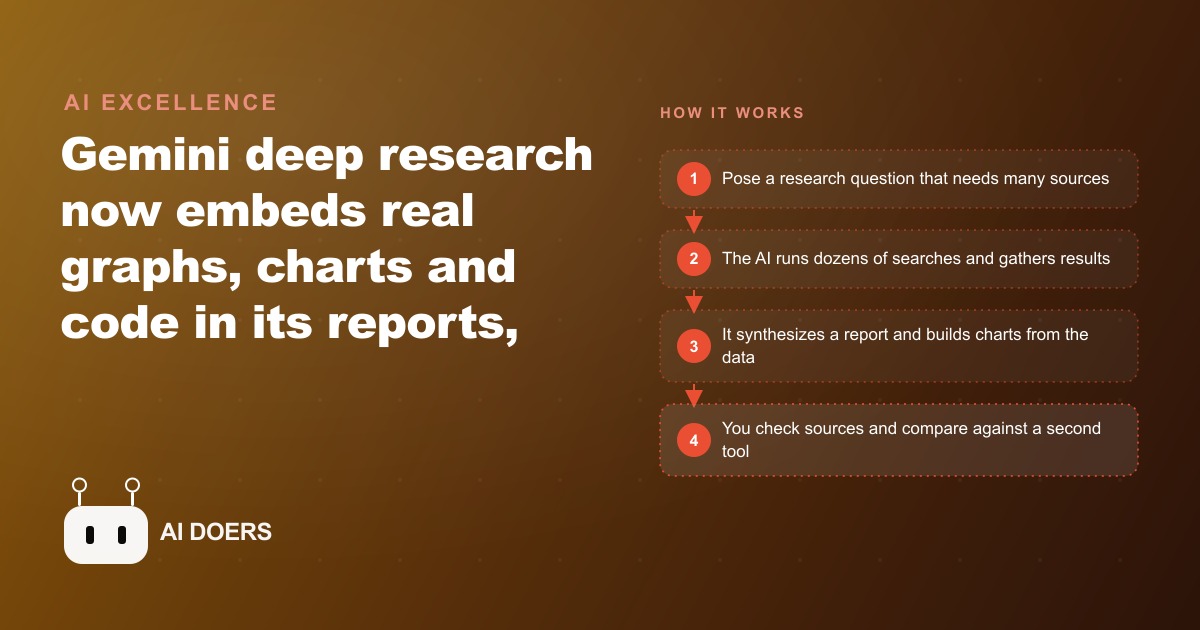
Gemini's Ultra-plan deep research now embeds real charts, graphs, and code directly in its reports instead of returning text only, and in side-by-side tests it sourced better and produced more well-rounded output than ChatGPT, making it the stronger deep research tool right now.

Why visual research reports close faster than text-only documents and what Gemini's deep research actually produces
I am Madhuranjan Kumar, and the tool behavior I find most interesting in Gemini's deep research feature is not the research itself. Any sufficiently large language model with web access can aggregate information across sources and produce a structured summary. What Gemini is doing differently is the output format, and the output format changes the audience relationship in a way that matters for business applications.
A text-only research report and a visual research report covering the same information produce different reactions from the people reading them. The visual report is more credible, more persuasive, and more likely to prompt a decision. Understanding why this happens explains why investing in visual output for AI-generated research is not a cosmetic upgrade. It is a functional one.
How text reports train readers to skim and miss the argument
Text reports produce a particular reading behavior in business audiences. The reader scans the headings, reads the first sentence of each section, and looks for numbers or highlighted text. The argument structure of the document rarely survives this reading pattern because the argument requires the reader to follow a sequence of connected points, and skimming breaks that sequence.
This is not a critique of how people read. It is a recognition that business readers are processing information under time pressure and have developed efficient heuristics for extracting the signal from documents quickly. The text report format was not designed with this reading behavior in mind, and most AI-generated text reports compound the problem by producing uniformly dense paragraphs without visual variation.
A visual report interrupts the skimming behavior at specific strategic points. A chart forces the reader to engage with a number in a spatial context rather than reading it in a sentence. A table forces the reader to compare multiple data points simultaneously. A highlight box signals that this specific claim is important enough to extract from the surrounding text. These visual elements are not decorations. They are attention direction mechanisms.
What Gemini actually builds when it runs a deep research session
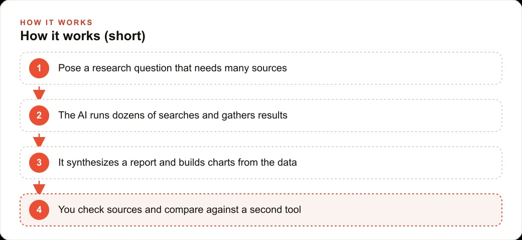
The architecture of Gemini's deep research output is worth understanding precisely because it determines what you can and cannot do with the result. A deep research session typically begins with the tool decomposing the research question into sub-questions, running searches on each, evaluating the results for relevance and credibility, and then synthesizing the findings into a structured document.
The synthesis step is where the visual elements appear. Gemini does not simply paste search results together. It identifies where comparative data can be presented in a table, where trends across sources support a visual summary, and where the document benefits from a hierarchy of evidence rather than a flat list of findings.
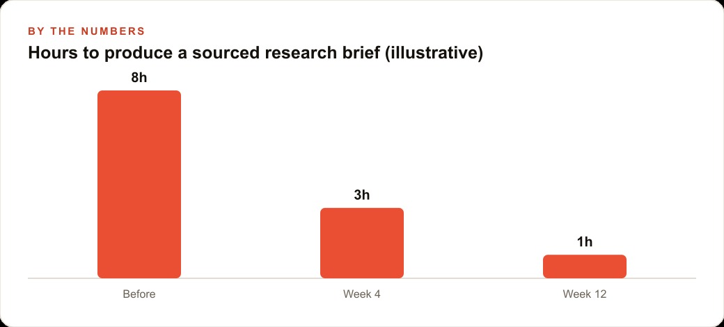
The practical output is a document that is longer and more structured than what most users produce when they do the same research manually. A research task that takes a skilled analyst three to four hours typically produces a 1,500 to 2,500 word document with three to five data comparisons. The Gemini equivalent takes 8 to 15 minutes of processing time and produces a document in the same range with a more complete citation trail because the tool tracks its sources systematically throughout the session.
What it does not produce is editorial judgment. The tool can identify that two sources contradict each other and note the contradiction. It cannot tell you which source is more credible based on context that is not in the text of the documents themselves. It cannot integrate non-public knowledge, internal business data, or insights that come from professional experience outside the text it is synthesizing. The practitioner using the tool provides those inputs.
The specific advantage that embedded charts give over referenced charts
A research document that describes a trend is less persuasive than a document that shows the trend in a chart. This gap is not just aesthetic. It is cognitive: reading the description of a trend requires the reader to construct a mental image of the pattern, while reading a chart provides the pattern directly. The mental construction step introduces error and produces less vivid encoding of the information.
The specific advantage of embedded charts versus referenced charts is even more significant. A referenced chart requires the reader to navigate to the source, open it, find the correct visualization, and return to the document. Most readers do not do this. A chart embedded directly in the research report is processed as part of the reading flow, without navigation friction.
For a business application of Gemini's deep research, this means the highest-value edit you can make to the raw output is identifying the two or three quantitative comparisons in the document that would have the most persuasive impact if visualized and embedding charts for those specifically. The full document does not need to be visualized. The decision-critical comparisons do.
A competitive analysis comparing three vendors across six criteria becomes significantly more persuasive when the criteria comparison is in a table rather than in six separate paragraphs. A market sizing analysis with year-over-year growth data becomes more credible when the trend is in a line chart rather than a sentence with three numbers in it.
Where business decision makers trust visual evidence more than text claims
The research on how business documents affect decision making in organizational settings points to a consistent pattern: visual evidence is processed as more credible than text claims when both cover the same information. The mechanism is not that decision makers are irrational. It is that visual evidence carries an implicit signal of rigor because it requires Madhuranjan Kumar to commit to specific numbers in a specific format. A chart that shows revenue declining for four consecutive quarters cannot be walked back or qualified the way a sentence claiming revenue has been challenging can be.
For an AI-generated research report, this credibility effect is particularly valuable because the audience may be skeptical about the quality of AI-generated analysis. A visually structured document with properly sourced charts and tables signals that the research was systematic and the findings are specific, even if the audience does not know that an AI tool generated the underlying document. The format communicates rigor before the content is read.
The implication for using Gemini deep research in a client-facing context is direct: the raw text output is internal working material, not the deliverable. The deliverable is the edited, visualized version of the same research, with the two or three charts that demonstrate the most important quantitative findings and a visual hierarchy that guides the reader to the decision-relevant sections.
The competitive intelligence use case where visual reports produce the largest advantage
The competitive intelligence application of deep research is where the visual output format produces the most measurable business advantage. A competitive analysis used in a sales conversation, a pricing decision, or a product roadmap discussion needs to be legible to an audience that includes people who were not involved in producing it. Those people need to grasp the key findings in the time it takes to present a deck or review a brief.
A text-only competitive analysis produced by Gemini deep research requires the reader to process the full document to extract the key insights. A visualized version of the same research can be structured so that the first three pages communicate the core competitive position clearly enough for a business decision, and the remaining pages provide supporting evidence for those who want to go deeper.
For a one-person AI consulting practice or a small agency using deep research as a client deliverable, the visualization step is the professional value-add that justifies a fee that the raw AI output alone would not support. Any client with a Gemini subscription can run the same research session. Fewer clients can translate the raw output into a structured visual document that their executive team can act on in a 30-minute meeting.
The research session is the commodity. The editorial judgment about which findings matter, which comparisons to visualize, and how to structure the argument for the specific audience and decision at hand is the professional service. Gemini's deep research feature makes the commodity part faster and cheaper. It does not replace the judgment part.
What a 30-minute research session produces that a 4-hour manual session does not
The comparison between AI-assisted deep research and manual research is usually framed around speed, which is accurate but incomplete. The speed difference is significant: a research session that would take an analyst four hours produces a comparable output in 8 to 15 minutes with Gemini's deep research. But the more important difference is coverage consistency.
A manual research process has blind spots that are determined by the researcher's existing knowledge and assumptions. The researcher knows which sources to check and checks them. Sources they do not know about or sources that appear in the margins of their primary search do not get checked. The coverage of the research is bounded by the researcher's prior knowledge.
An AI-assisted research process starts from a decomposed set of sub-questions and pursues each one independently across a broader source set than any manual researcher would check systematically. The coverage is more complete because it is not bounded by the researcher's prior knowledge about where the relevant information lives.
This coverage consistency advantage is most valuable in competitive research, market sizing, and regulatory scanning: contexts where the most important finding is often the one the researcher did not know to look for. A competitor analysis that only checks the sources the analyst already monitors will miss the smaller competitor who published a significant case study three months ago in an industry journal the analyst does not follow. The AI-assisted version will find it.
The three-layer output structure that makes visual reports actionable
A visual research report that is structured to support a specific decision needs three layers: the executive summary that states the decision and the recommendation clearly, the evidence section that provides the two or three visualized data points that most directly support the recommendation, and the supporting detail section that provides the full research for the people who will need to evaluate the evidence behind the recommendation.
Most reports that practitioners deliver are missing the first layer or conflating the first and second layers. A report that begins with the methodology and builds toward the recommendation requires the reader to process the full document before understanding what action is being recommended. Busy decision makers will not do this. They will read the first page, conclude that the report requires more attention than they have available right now, and defer the decision.
A report that begins with the recommendation and the two most important pieces of evidence supporting it allows the decision maker to engage immediately. They can assess whether they agree or disagree with the recommendation before they read the supporting detail. If they agree, they approve and move on. If they disagree, they go to the evidence section to understand the basis for the recommendation and form their own view.
Gemini's raw deep research output is typically structured in the third layer only: full evidence without executive summary or visualized key findings. The practitioner's job is to add the first two layers: extract the recommendation that the research supports, identify the two or three data points that are most persuasive, visualize those data points, and structure the document so that the executive summary and evidence come before the supporting detail.
The practitioner who masters the research-to-visual-report conversion is building a skill that scales independently of how the underlying AI research tool improves. Better AI research produces richer raw material. The practitioner's job of translating that raw material into a structured, visualized document suited to a specific audience and decision remains the same regardless of which model runs the research session. That translation skill is the durable differentiator.
The report format is the product. The research engine is the commodity.
That is exactly what we do at AI DOERS. Book a private 30-minute call with Madhuranjan Kumar and we will map the fastest path to it for your specific business.
Book your call →
Madhuranjan Kumar
Madhuranjan Kumar brings 20 years of performance-marketing experience and has managed over $200 million in Facebook ad spend for brands across the United States and beyond. His expertise spans the full modern marketing stack: Meta, Google Ads, TikTok, email automation, CRM, and the websites that hold it together. At AI DOERS he turns that track record into lead-generation systems for businesses across every industry.