
How I Designed a Full Chat App With AI Vision and No Design Skills
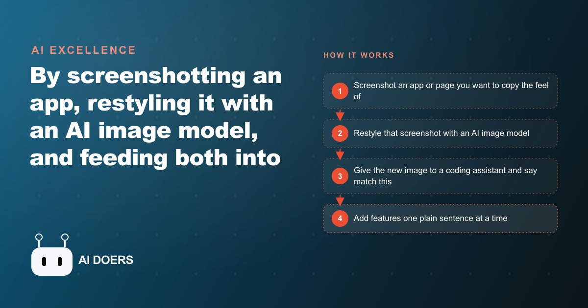
By screenshotting an app I liked, restyling it with an AI image model, and feeding the picture into a coding assistant, I built a complete styled app in one sitting. Here is the exact flow and how I would run it for a real business.

For years the wall between a good idea and a good-looking product was design skill. You either learned a design tool, hired someone who had, or shipped something that looked homemade and hoped customers would forgive it. I am Madhuranjan Kumar, and I want to argue that this wall has quietly fallen, and that most people have not noticed yet. I built a complete, styled chat app in a single sitting, with a soft custom background, a side panel, a notes feature you save from highlighted text, and even background music, and I never once opened a traditional design program. The interesting part is not that I did it. It is what the doing reveals about where the real work now lives.
A picture became the instruction
The whole method rests on one shift in thinking: stop describing what you want in words, and hand over a picture instead. Words are a terrible medium for design. You can write make it clean and modern for an hour and still get something you hate, because clean and modern mean a hundred different things. A picture collapses all of that ambiguity into a single reference the machine can actually see and copy.
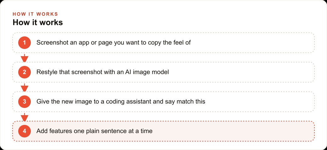
So I started not with a blank canvas but with a screenshot of an app whose feel I admired. I captured it twice, once with the sidebar closed and once open, so the model could see both states. Then I uploaded that screenshot to an AI image model and asked for a calmer, cleaner treatment, a soft background, gentle angles, the eye pulled toward the input field. What came back was a restyled version I could never have drawn by hand, and I am not being modest about that. I have no design training. The model did the part I cannot do, and it did it in seconds.
The second half was even less glamorous, which is the point. I opened an AI coding assistant on top of a plain starter template and gave it two things: the restyled image and a single plain sentence asking it to make my app look like that. From there, every change was a sentence. Put the new background behind the chat. Soften the message bubbles. Use an off white instead of pure white. Add light borders. When something broke, and things break constantly, I copied the error message, pasted it back, and asked for a fix. That rhythm, run, break, paste, fix, is the actual texture of building this way. It is not elegant and it does not need to be, because the loop closes so fast that a broken state is never more than a paste away from fixed.
Assets were the same story. A generated logo and an audio file went straight into the project folder, and I simply asked the assistant to place the logo in the corner and add a play button for the song. For the logo itself I went back to the image model, asked for an icon in the same visual language as the app, removed its background, and dropped it in. A brand mark that once meant a designer and a few days of back and forth took minutes. None of these steps required me to know syntax, and none of them required taste I do not have. They required me to know what I wanted and to describe it one small piece at a time.
Why this matters more than it looks
It is easy to file this under neat trick and move on. That would be a mistake, because the implication for a small business is large. Almost every local business has a pile of small digital jobs that never get done, not because they are hard, but because nobody on the team can design. A booking page that looks trustworthy. A simple internal tool. A customer-facing app that reflects the brand rather than embarrassing it. These stall for years because the design step is a wall, and hiring for a one-page job feels absurd. Knock the wall down and those jobs become an afternoon.
I keep coming back to a specific feeling most owners know: you look at a competitor's slick booking flow, or a well-made app, and think I wish mine looked like that. Until now that thought led nowhere useful. Today it is an actionable plan. You screenshot the thing whose feel you admire, restyle it into your own colors and brand, and rebuild it. You are not copying their code or their content. You are capturing the sense of calm competence that good design communicates, and porting it onto your own product. That feeling of professionalism is worth real money at the moment a customer decides whether to trust you with a booking or a payment, and it used to be locked behind a skill most small teams simply did not have.
To make it concrete, picture a pest control company. Its owner wants a clean page where a homeowner can request a visit and get a quote, and right now they have nothing, because building it always felt like a project. Using the exact flow I described, the owner starts by screenshotting a booking page whose layout feels calm and trustworthy. They restyle that screenshot with an image model into the company's own colors, something fresh and tidy that signals a professional crew rather than a guy with a truck. They hand that image to the coding assistant and ask for a simple page where a homeowner picks a service, ants, rodents, a termite inspection, describes the problem, and requests a visit.
Then the features arrive one sentence at a time, the same way my notes panel and music player did. A photo upload, so the customer can snap the bug or the damage before anyone drives out. A notes box for gate codes and pet warnings, the small details that make a first visit go smoothly. A clear confirmation screen so nobody wonders whether the request went through. The company logo, generated as an icon and wired into the header. When a field throws an error, the owner pastes it back and lets the assistant fix it. By the end of an afternoon there is a branded request app that looks designed rather than thrown together, and no designer was ever hired.
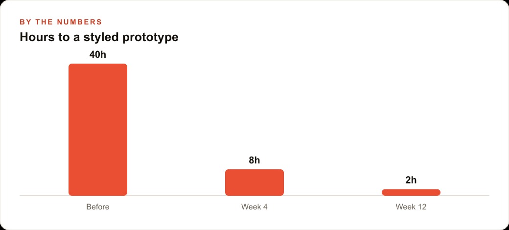
The payoff is easiest to see in illustrative terms. Building something like that used to represent something on the order of forty hours once you account for learning a tool, or a real invoice from a freelancer. With this approach the same styled prototype is a few hours of plain-language back and forth, and after a couple of projects it compresses toward a single focused sitting. Those figures are illustrative rather than measured, but the direction is unmistakable: the cost of a good-looking first version is falling toward the cost of the time you spend describing it. And a page like that does not sit in isolation. Once it exists, it becomes a real destination for Facebook and Instagram ad campaigns to send traffic to, a clean landing experience that gives the clicks somewhere worthwhile to arrive.
The run, break, paste, fix loop is a skill worth naming
I want to dwell on that loop for a moment, because it is the part people underestimate and the part that actually determines whether you finish. When you build this way, things break constantly, and that is not a sign you are doing it wrong. It is the normal texture of the work. A layout stacks wrong, a link points nowhere, a feature half-loads. The old instinct is to panic and start reading code you do not understand. The new instinct, the one that makes this method fast, is to treat every error as a message rather than a wall. You copy it, you paste it back, you describe what you expected instead, and you rebuild.
What makes the loop powerful is how tight it is. In traditional development the gap between hitting a bug and fixing it could be hours, because you had to understand the code, form a theory, test it, and repeat. Here the gap is a paste and a sentence. That short feedback cycle changes your whole relationship with mistakes. You stop fearing them, which means you experiment more, which means you end up with something better than you would have planned on paper. The people who thrive with these tools are not the ones who avoid errors. They are the ones who have made peace with the loop and keep it moving. That temperament, patient and unbothered by breakage, matters more than any technical background, and it is entirely learnable.
The bottleneck moved, and most people are aiming at the wrong one
Here is the part I feel strongest about. When a skill becomes cheap, people assume the whole job becomes cheap. It does not. The bottleneck just moves, and it moves to judgment. The building is now the easy part. What is hard, and what still separates a result people love from a working but forgettable mess, is knowing which reference to start from, which features actually help a customer finish faster, and how to keep the whole thing consistent as it grows. That is where I watch people get a functional but sloppy result and quietly give up, convinced the tools failed them. The tools did not fail. The judgment about what to build was missing.
Think about what actually goes wrong when someone gets a working but forgettable result. It is almost never the styling, because the model handles styling well. It is that they built the wrong thing. They added five features a customer does not care about and left out the one that would have earned the booking. They chose a reference that looked impressive but signaled the wrong thing for their trade. They let the design drift as they bolted on pieces, so the finished app feels like three different apps stapled together. Every one of those failures is a judgment failure, not a tooling failure, and no image model or coding assistant will save you from it, because those tools do what you ask, and the whole problem is that you asked for the wrong thing.
That judgment is not a design skill and it is not a coding skill. It is closer to marketing sense and product sense combined: understanding what a customer needs to see to trust you, what friction makes them abandon a form, and what a page has to do to earn a booking. Those instincts do not come free with the model. They come from having done it many times. And they are exactly what carries over into everything adjacent to the page you build. The same instincts that make a pest control booking flow convert are the instincts behind a strong CRM and website stack, where the request the customer submits triggers the right follow-up, and behind content that earns its place in SEO and organic search rather than just filling space. The design wall is gone. The taste and judgment behind good design are the new scarce resource, and they always were the point.
So my honest advice is to try this yourself, and to start small. Take one screen, not a whole product. Screenshot a reference you genuinely like, restyle it with a free or low-cost image model, and prove the look on a single page before you add any logic. Then add features one at a time, in plain language, and keep the run, break, paste, fix loop tight so small errors never pile into a mess you cannot untangle. Save your logo and images into the project folder and refer to them by name. You will be surprised how far you get. And if you would rather skip the learning curve on the judgment part, and hand the whole thing to someone who has wired these flows up many times and can deliver a finished, on-brand app, that is exactly the kind of work I take on. Either way, the wall you thought was there is not. The only question left is whether what you build is worth building, and that has always been the real question.
That is exactly what we do at AI DOERS. Book a private 30-minute call with Madhuranjan Kumar and we will map the fastest path to it for your specific business.
Book your call →
Madhuranjan Kumar
Madhuranjan Kumar brings 20 years of performance-marketing experience and has managed over $200 million in Facebook ad spend for brands across the United States and beyond. His expertise spans the full modern marketing stack: Meta, Google Ads, TikTok, email automation, CRM, and the websites that hold it together. At AI DOERS he turns that track record into lead-generation systems for businesses across every industry.