
How to Build a Mobile AI App With No Code and Put It on the App Store
You no longer need a developer to ship a mobile app. With a no-code AI app builder you can describe what you want, refine it for phones, wire in an AI model, and publish to the App Store and Play Store yourself.

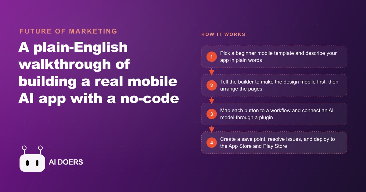
Building a mobile app used to require a developer. That requirement changed recently in a way that is not well understood even by business owners who have been paying attention to AI tools. I am Madhuranjan Kumar, and I want to explain not just that no-code mobile AI app building works, but what the specific mechanisms are that make it work, what the honest constraints are, and why mobile stayed harder than web for longer. The tool is genuinely useful. Understanding it at the right depth is what makes the difference between shipping something real and spending a week in a builder without a product to show for it.
Why mobile stayed hard after web building got easy
Web app building with AI assistance reached a workable state before mobile did, and the gap is worth understanding because it explains why the template approach is so critical for mobile specifically. A web app runs in a browser, which handles most of the platform compatibility work automatically. The developer, or the AI acting as developer, produces one codebase and the browser adapts it to the device. A mobile app has to pass review by Apple and Google, comply with specific human interface guidelines for each platform, declare in advance what hardware and data it will access, provide working demo accounts for reviewers, and satisfy a list of requirements that change when platform policies change.
That review layer is the structural barrier that kept mobile app building difficult even after AI coding became capable. A capable AI can write mobile app code. Getting that code through the App Store review process is a separate skill involving knowledge of what reviewers look for, what rejection reasons are common, and how to address them before submission rather than in a revision cycle after rejection. No-code mobile builders absorb much of that complexity into the platform itself. They produce output that already satisfies the basic structural requirements for App Store and Play Store submission because the platform's output is validated against those requirements as a product design constraint, not as an afterthought.
The template as the non-obvious key to a manageable build
Starting from a blank project in a no-code mobile builder is the mistake that produces overwhelming experiences for first-time builders. A blank project requires every configuration decision to be made from scratch: the navigation structure, the authentication pattern, the data connection approach, the state management model. These decisions interact with each other in ways that produce cascading problems if the wrong combination is made early, and the mobile builder's visual interface makes it easy to make them without realizing their implications.
A beginner mobile template is built by people who made all of those foundational decisions correctly for a specific category of starting point. A login-and-register template has a working authentication flow, a persistent session, and a navigation structure that connects to a home screen after login. That foundation handles the infrastructure that would otherwise consume the first day of any new project. Your first prompt goes toward the feature your business needs, not toward solving problems that every mobile app has already solved before yours.
The path file is the second architectural layer that beginners consistently underuse. A path file in a well-designed template is a markdown document that describes how to build a specific feature type inside that template's architecture: how to add an API connection, how to wire a new screen to the navigation, how to save and retrieve user data. When you reference the path file in your prompt, the AI has a structured guide that fits the template you are working in rather than inventing an approach from scratch that may conflict with the template's existing architecture. That reference is the difference between a prompt that integrates cleanly into the existing codebase and a prompt that produces a parallel structure that needs manual reconciliation.
The workflow loop between prompting and visual building
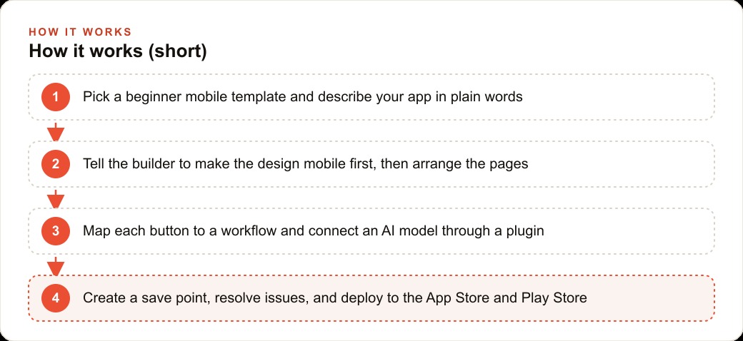
The workflow in no-code mobile building is not purely conversational and not purely visual. It is a loop between the two. You prompt the AI with a feature description and a path file reference. The AI generates the first version in the prompting interface. You switch to the visual builder to see the result and identify the elements that need adjustment. You return to the prompting interface with a specific, targeted follow-up instruction. The output improves. You check it again in the visual builder. This loop continues until the feature is correct.
Understanding that this is a loop rather than a one-way path is what keeps first-time builders from getting stuck. The experience of generating a first version that is not quite right is not a failure. It is the expected first step in a normal iteration cycle. The second prompt is not a correction of the first. It is the next step in a planned sequence of refinements. Treating each generation as a starting point for the next instruction, rather than as a final result to be accepted or rejected, is the workflow mindset that produces a completed app.
The save point discipline is what makes the loop feel safe rather than risky. Before any follow-up prompt that might introduce a significant change, creating a version save point means that if the change breaks something that was previously working, you roll back to the save point and try a different approach. Without save points, a prompt that breaks navigation between screens forces you to trace back through the change history to find where the break occurred, which is time-consuming and sometimes requires rebuilding sections from scratch. With save points, the worst case is losing the work since the last save point, which is typically a single feature attempt.
How buttons and workflows carry the entire logic of the app
The core insight about no-code mobile app logic is that every behavior the app has is defined by the combination of buttons and workflows. A button appears on a screen and triggers a workflow when tapped. The workflow defines what happens: navigate to a different screen, save data to the user's record, send a request to an external API, display a message, or some combination of those actions in sequence. There is no other mechanism through which the app does things. Every feature, every data interaction, every navigation, every AI response: all of them are button-triggered workflows.
This architecture is powerful because it is explicit. You can look at any button and ask "what does this button do" and trace exactly through the workflow it triggers to understand every action the tap produces. There are no hidden behaviors, no implicit side effects, no interactions that happen without a button trigger in the chain. That explicitness is what makes debugging in a no-code mobile builder tractable for a non-developer: if something is not happening, the workflow for the button that should trigger it is either misconfigured or missing.
The AI plugin that connects the app to a real language model works through this same mechanism. A user types a prompt into an input field and taps a button. The workflow triggered by that tap sends the input to the language model API through a plugin connection and receives the response. The response is displayed in an output area on the same screen. The only technical element is wiring the API plugin with the correct endpoint and credentials. The builder's plugin library handles the API connection mechanics, and the workflow handles the data flow between the input field, the API, and the output display.
The mobile-first instruction that determines whether the output is actually usable on a phone
The single instruction that most first-time builders omit and that produces the most consistently damaging result when omitted is the instruction to make the design mobile first. No-code builders default to a desktop layout because web is a larger audience and desktop layouts are what the tool was originally optimized for. A desktop layout has elements sized for a large screen, spacing calibrated for a mouse cursor, and font sizes appropriate for viewing from a meter away. On a phone screen, all of those choices are wrong. Buttons are too small to tap without a precise touch. Text is too small to read at arm's length. Input fields require pinching to zoom rather than being natively sized for touch.
Adding "make the design mobile first" to the first prompt takes five seconds and prevents a design revision session that can take an hour. The mobile-first output sizes elements for touch targets, spaces content for a portrait screen, and sets text sizes for reading at a hand-held distance. Every subsequent feature added through follow-up prompts is generated in the same mobile-first context because the instruction shaped the foundational design choices before any screens were built.
What the App Store submission process actually requires
Submission to the App Store and Play Store is where the no-code mobile build connects to the platform requirements that have always made mobile harder than web. Both stores have a review process that checks the app before it becomes publicly available, and both stores reject submissions for reasons that are highly predictable if you know what to look for.
The most common rejection reasons for a first submission from a no-code builder are: a missing privacy policy page linked from within the app, insufficient description of how user data is collected and used in the store listing, missing demo account credentials that allow the reviewer to test the app without signing up as a real user, and screenshots that do not match the actual app UI. All four of these are preventable with a checklist review before submission. The review process at Apple typically takes one to three days and at Google typically takes a few hours to a day. A rejection adds that window to the launch timeline, so a preventable rejection is worth preventing.
Testing on a real physical device before submission is a non-optional step that is frequently skipped in favor of the simulated device view in the builder. The simulator is accurate enough for development but not perfectly accurate for the touch behavior and rendering of a real phone. A feature that works correctly in the simulator occasionally has a tap target that is slightly off on the physical device, a scroll behavior that feels different in actual hand, or a layout that renders differently on a specific screen size. Catching those discrepancies before submission requires a physical device test, and fixing them before submission requires going back through the iteration loop. The time cost of that loop before submission is always lower than the time cost of a rejection and resubmission cycle.
The App Store on every phone is a distribution channel with no algorithm gatekeeping access once the app is live. A customer who downloads the app has it on their home screen with no dependency on social media reach, email open rates, or search rankings. For service businesses that depend on recurring client relationships, that persistent touchpoint is worth the investment of one focused afternoon to build and the careful submission work to launch correctly.
That is exactly what we do at AI DOERS. Book a private 30-minute call with Madhuranjan Kumar and we will map the fastest path to it for your specific business.
Book your call →
Madhuranjan Kumar
Madhuranjan Kumar brings 20 years of performance-marketing experience and has managed over $200 million in Facebook ad spend for brands across the United States and beyond. His expertise spans the full modern marketing stack: Meta, Google Ads, TikTok, email automation, CRM, and the websites that hold it together. At AI DOERS he turns that track record into lead-generation systems for businesses across every industry.